| Author | Thread |
Comments Made During the Challenge  |
|
|
05/18/2004 06:26:12 PM |
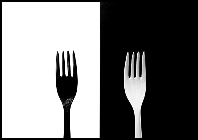
| Sorry, but the paint on the white fork is really unappetizing. It would have been worth your time to run to the corner store and get a real white plastic fork for this idea. |
|
|
|
05/18/2004 04:45:15 PM |
| Very nice arty shot. Strikingly obvious opposites and a well executed photo. Well done |
|
|
|
05/18/2004 01:57:22 PM |
|
|
|
05/15/2004 10:11:59 AM |
| Simple and effective. This is one of several that used the black/white technique with eating utensils or something similar. Since yours is divided exactly in half and not placed in a diagonal composition, it is not as dynamic as some. The thin white line on the border is a bit unusual - showing only on the handle of the black fork. |
|
|
|
05/13/2004 02:55:01 PM |
| Very nice frame and overall composition. Good use of contrast / neat image to deliver a very clean image. An 8. |
|
|
|
05/13/2004 12:09:18 AM |
| it looks like forks arent sitting level, and the glare could go, but very nice picture and contrast |
|
|
|
05/12/2004 10:33:23 PM |
| Nice. I've done one similar, but I didn't enter the challenge. Good luck. Nice, simple, clear. |
|
|
|
05/12/2004 08:56:22 PM |
| Is the opposite in this the color? I might have used a spoon and a fork instead of two forks...but that's me. I wish the forks were more symmetrically placed. |
|
|
|
05/12/2004 07:07:06 PM |
| I like your idea. Excellent for the challenge. I do wonder why all the negative space on the sides and the bottom of the forks are cut off? Just seems an odd way to crop this.........? Good luck in the challenge. |
|
|
|
05/12/2004 03:54:01 PM |
| Haha! Simple and amusing. I like it :) I gave you an 8. |
|
|
|
05/12/2004 03:35:02 PM |
|
|
|
05/12/2004 09:28:18 AM |
| Good composition. Clever. The borders detract from the smoothness of the transition from white to black. |
|
 Photographer found comment helpful. Photographer found comment helpful. |
|
|
05/12/2004 06:20:04 AM |
| Beautiful. Should definitly be top 10! |
|
|
|
05/12/2004 03:06:36 AM |
| I really like this, definately meets the challenge 100%. Great white balance, the contrast between them is perfect. Only thing I would have liked to have seen different was that there is a reflection on the black fork? A wee bit destracting. Well done!! |
|
| Photographer found comment helpful. |
|
|
05/12/2004 01:11:58 AM |
| Clever and graphically interesting. Nice work! 8 |
|
Home -
Challenges -
Community -
League -
Photos -
Cameras -
Lenses -
Learn -
Help -
Terms of Use -
Privacy -
Top ^
DPChallenge, and website content and design, Copyright © 2001-2025 Challenging Technologies, LLC.
All digital photo copyrights belong to the photographers and may not be used without permission.
Current Server Time: 03/12/2025 10:33:56 PM EDT.