| Author | Thread |
|
|
05/28/2004 03:53:27 PM |
:: Critique Club Comment ::
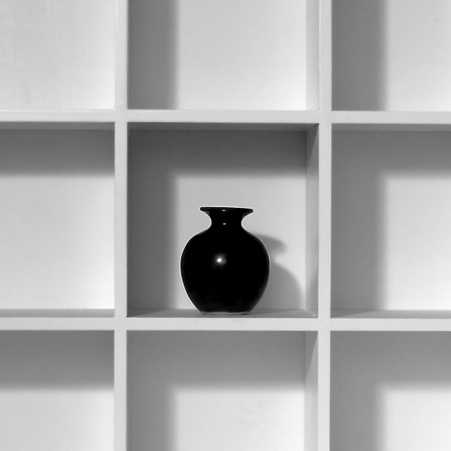
this is a very peaceful photo to look at, first of all because of the composition and second because of the black and white.
In the composition, everything is working for the middle piece, the vase. The lines seem to cut the photo, leaving the middle. The vase itself is not really in the center, but you absolutely created the IDEA that the vase is centered.
It seems to me that the lines are a bit tilted, I don't know whether my eyes are playing tricks on me, because you didn't stand in front of the cupboard, but slightly to the left of it (because I can see the sites of the right board, but not the sites of the left board), or because the photo IS tilted. You can easily figure this out in Photoshop (for example).
For a black and white picture, there is a lot of grey showing. The vase is nice and deep black, but the parts of the cupboard that aren't in the shadows, would have made the photo more attractive when they would have been a bit more white.
There is nothing wrong with this picture, but the centering of the main object, leads in this photo to a peaceful picture. This photo is a great example that a move of the vase to the left or to the right would have spiced up the picture a lot..
but since this was the challenge of the 'centered composition' you did a really good job on it!
Fotowereld. |
|
 Photographer found comment helpful. Photographer found comment helpful. |
Comments Made During the Challenge  |
|
|
05/23/2004 10:21:13 PM |
| Simple and to the point. Love the lighting. One of my favorites. |
|
| Photographer found comment helpful. |
|
|
05/23/2004 08:07:01 PM |
| A small amount of CCW arbitrary rotation would have helped. |
|
| Photographer found comment helpful. |
|
|
05/20/2004 11:35:30 PM |
| I like the minimalist composition here, but the shadows are very distracting |
|
| Photographer found comment helpful. |
|
|
05/20/2004 08:11:49 PM |
| Perfect. Another 10 for me. I love the shadows. So lighting is definately a key factor here, and you hit it just right. Love the black and whiteness. The little light reflection on the vase is great. I like it just the way it is. Focus and clarity are great, and the centeredness is also wonderful. Thanks for this image. ~Heather~ |
|
| Photographer found comment helpful. |
|
|
05/20/2004 04:57:11 PM |
| This would be more effective if it were dead-on straight and centered. It's close, but it makes it look more like a snapshot instead of a great photo. But still a good photo, good score. |
|
| Photographer found comment helpful. |
|
|
05/20/2004 06:37:54 AM |
| good chice of objects...the light/contrast could be improved though by chainging the curves in ps...also the the rack is out of focus...maybe due to a large aperture!? |
|
| Photographer found comment helpful. |
|
|
05/19/2004 11:09:31 AM |
| Nice range of exposure! The framing seems a bit tilted (sinks to the right a bit, I think . . .) |
|
| Photographer found comment helpful. |
|
|
05/18/2004 09:46:11 PM |
Very good. This plays well with the challenge. I like the absence of any bright colors here, but it might have worked well with a bright flower in the black vase.
Great Job. |
|
| Photographer found comment helpful. |
|
|
05/18/2004 07:19:37 PM |
|
| Photographer found comment helpful. |
|
|
05/18/2004 02:17:22 AM |
| Nice picture. Camera seems a little tilted counter clockwise? |
|
| Photographer found comment helpful. |
|
|
05/17/2004 05:34:04 PM |
| leveling the shelves would help |
|
| Photographer found comment helpful. |
|
|
05/17/2004 01:23:43 PM |
Challenge centered –10
Creative –9
Appeal (is it interesting?) –5
Technical -10
score 9
|
|
| Photographer found comment helpful. |
|
|
05/17/2004 10:12:56 AM |
| The clockwise tilt is a significant distraction to me. In something with so few design lements the details are emphasized. |
|
| Photographer found comment helpful. |
|
|
05/17/2004 06:58:17 AM |
|
| Photographer found comment helpful. |
Home -
Challenges -
Community -
League -
Photos -
Cameras -
Lenses -
Learn -
Help -
Terms of Use -
Privacy -
Top ^
DPChallenge, and website content and design, Copyright © 2001-2025 Challenging Technologies, LLC.
All digital photo copyrights belong to the photographers and may not be used without permission.
Current Server Time: 03/12/2025 01:26:27 PM EDT.