CRITIQUE CLUB CRITIQUE
by karmat
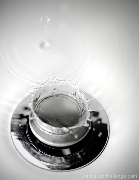
Compositionally, I like that this is not centered, and that you have not "cut off" any of the drain (though that can work sometimes). However, it seems to be a bit unbalanced, still. I'm thinking if there were more negative space to the right and top *might* make it feel more balanced.
Technically, generally speaking, the exposure, focus, etc is very well done. Also, you have done well in teh bw conversion. I think what might detract a bit is the top of the splash is not as sharp as the rest, or as distinct from rest of the sink. In shots like this, it seems that people look around the rim of the water drop more than the base. If the "rim" isn't well focused, it takes away from the shot a bit.
Overall, a good shot, and I can see the connection to the original.
Best to you in future challenges.
Karma |