| Author | Thread |
Comments Made During the Challenge  |
|
|
05/20/2004 10:19:45 PM |
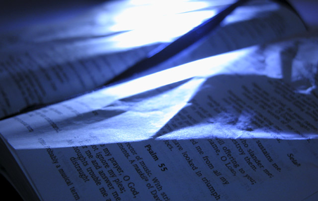
| The lighting makes it kinda hard to recognize the Bible at first glance. Raise the lightsource higher, so it doesn't shine across the page so much. |
|
|
|
05/20/2004 11:28:03 AM |
| I don't find this photo very interesting. The back light seems too harsh (and blue). The wrinkled pages are distracting, though I like the shadows some of the wrinkles cast. |
|
|
|
05/20/2004 05:40:49 AM |
| It looks to me like the good habit is screwing up pages of the bible - surely you didn't mean that? The lighting is a little harsh. Blue colour is nice. |
|
|
|
05/19/2004 11:24:07 PM |
| Like everything but the blown out highlights. They really distract from any pic. |
|
|
|
05/19/2004 04:33:05 PM |
| it's good but why is it wrinked? |
|
|
|
05/19/2004 02:42:12 PM |
yes it is..
Now, look out for the overexposed sections of the photo... try to soften your source light some more... I assume it was a window or something.. this photo would be much better with a softer light source and a matching supplimentary light source to lighten the darker portions of the pages. (like above or behind the camera) |
|
|
|
05/19/2004 06:59:09 AM |
| It's s good photo, but I feel it would have been better if the pages wouldn't have been wrinkled. |
|
|
|
05/19/2004 06:27:34 AM |
| The reflections are a bit too strong and the image is too blue for my taste. But otherwise a good picture! |
|
|
|
05/19/2004 03:52:46 AM |
| I like this photo. It definitely draws interest with the subject and communicates the challenge's theme in an almost abstract way. Nice work. |
|
Home -
Challenges -
Community -
League -
Photos -
Cameras -
Lenses -
Learn -
Help -
Terms of Use -
Privacy -
Top ^
DPChallenge, and website content and design, Copyright © 2001-2025 Challenging Technologies, LLC.
All digital photo copyrights belong to the photographers and may not be used without permission.
Current Server Time: 03/12/2025 02:23:36 PM EDT.