| Author | Thread |
|
|
11/28/2002 08:07:00 PM |
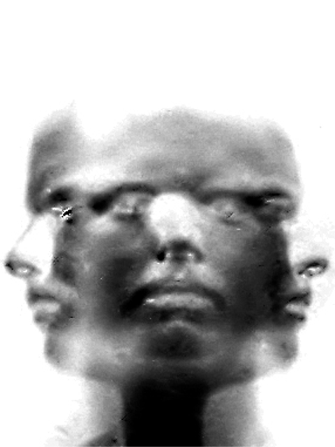
| rule of thirds not used? i beg to differ! top of head 2/3, mouths 1/3, three faces separated into thirds. this is a very good example of the rule of thirds in a photograph! |
|
|
|
11/24/2002 06:52:00 PM |
Composition: It is obvious there is one person's face repeated 3 times. The focal point is the eyes although the noses seem to draw attention to them because of the higher contrast created by the little white dots. The rule of thirds is not used in this image and it looks fine the way it is. There is added space at the top that is left there to accomodate the longer thinner composition. The space at the top is more important than say cropping out part of the noses.
The black and white of this image add to the starkness/expressionlessness of the person's face. I'm not sure what the harsher areas near the left eye and a bit under the right eye of the center face. This image works well with each face with the same expression. Did you try using 3 different expressions? I think 3 different expressions would have improved the impact slightly because it would have given extra meaning to the photograph. Each person has more than 1 emotion and the image would have helped portray that.
Technical. The image is quite soft... and it is evident that the softness was intentional. I would have liked to see a little more detail in the face. I like the fact that the hair is not visible. Each of the side faces blends fairly well with the blank background. I do find the grey area around the right nose distracting because it's not part of the image. It's just grey. Also the left nose is much more transparent than the right nose.. why? I personally would have boosted the contrast a little bit more..
Overall I think this is a very neat photo and I agree that it should have done better. Well thought out and reasonably well executed. Good job! |
|
|
|
11/04/2002 02:56:00 PM |
| this is so cool! can't believe you didn't score higher! |
|
|
|
11/04/2002 08:23:00 AM |
| should have done better ! |
|
|
|
11/03/2002 07:28:00 PM |
| Great effect. One of my favs this week. Jak 8 |
|
Comments Made During the Challenge  |
|
|
11/01/2002 06:52:00 PM |
|
|
|
11/01/2002 01:05:00 PM |
| this reminds me of '70s cyborg art'. i like the grainy blown out quality of it. mag99 |
|
|
|
10/30/2002 06:54:00 PM |
Bizarre! What are the marks from? (ex. left side eye and nose, middle right eye)
I am sorry, but to me, this seems more photoshop than photography. I am very willing to re-examine my score. 7 Swash |
|
|
|
10/29/2002 10:20:00 PM |
| what is the bug on the left face cheek. That immediately grabbed my attention. Realize focus hard to get with this but lack of it ruins it for me. |
|
|
|
10/29/2002 12:38:00 PM |
| shot reminds me of B&W movie "Metropolis"...like the solarized look of this piece, also. good concept! (8) ~mcmurma |
|
|
|
10/28/2002 10:36:00 PM |
| Cool photo. Great job. How'd you do it? |
|
|
|
10/28/2002 07:36:00 PM |
| the thumbnail looks great, the noise really detracts from the beauty of this. |
|
|
|
10/28/2002 11:48:00 AM |
| This is good except for the little bits of photo-debris on the shot at eye level. Take those out and it would be a 9 - with it, a little less - Inspzil |
|
|
|
10/28/2002 10:20:00 AM |
| Cool. I like it. 9 paganini |
|
|
|
10/28/2002 01:18:00 AM |
| Awesome ! - 10 Shiiizzzam |
|
|
|
10/28/2002 12:41:00 AM |
| I think this is cool. I like how it ended up. Might be a little too digital for some voters, but it's all legal so... I should try this some time. Just afraid I'd get dizzy ;o) ~indi |
|
Home -
Challenges -
Community -
League -
Photos -
Cameras -
Lenses -
Learn -
Help -
Terms of Use -
Privacy -
Top ^
DPChallenge, and website content and design, Copyright © 2001-2025 Challenging Technologies, LLC.
All digital photo copyrights belong to the photographers and may not be used without permission.
Current Server Time: 03/12/2025 01:55:46 AM EDT.