| Author | Thread |
Comments Made During the Challenge  |
|
|
03/17/2009 08:59:22 PM |
|
|
|
03/17/2009 06:12:04 PM |
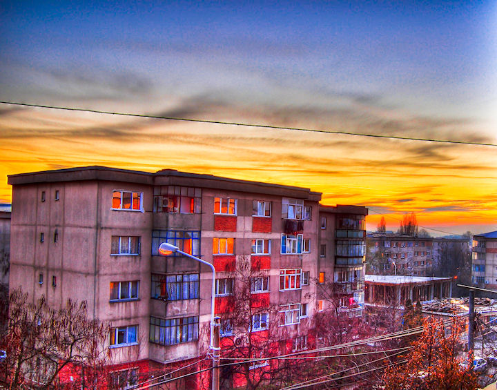
| I really like the colors on the building in this, colorful building and colorful sky, very nice. |
|
|
|
03/17/2009 01:20:09 PM |
| Much too over processed for my liking. HDR? |
|
|
|
03/17/2009 09:02:47 AM |
|
|
|
03/17/2009 12:04:00 AM |
| You know what I find myself wondering as I look at this? I wonder how many people have suggested or wished for the lone power line above the buildings to be cloned out or just gone. I like it. I like how it divides the sky. And though I'm not a fan of HDRish looking photographs, I find it appealing in the instance. Perhaps it's the urban setting...quite enjoyable. |
|
|
|
03/16/2009 10:32:52 PM |
| I don't like the colors, they seem unnatural |
|
|
|
03/16/2009 05:45:03 PM |
| Good colours, but the processing makes it look unnatural. |
|
|
|
03/16/2009 01:02:25 PM |
| Nice use of lighting. The coloring is very vivid. |
|
|
|
03/16/2009 12:27:38 PM |
| Not fond of the processing. Sorry... |
|
|
|
03/16/2009 08:53:14 AM |
| frankly, the HDR looks overdone |
|
|
|
03/16/2009 04:07:21 AM |
|
|
|
03/16/2009 03:10:08 AM |
| Well captured and presented. |
|
|
|
03/16/2009 12:38:33 AM |
| I'm liking this picture more and more with each second in viewing. It struck me as over processed, maybe the orange part is, cool looking urban image, that cable and power lines are score hurters. |
|
|
|
03/15/2009 10:08:42 AM |
|
|
|
03/15/2009 09:50:10 AM |
| Wonderful colors and post processing. |
|
|
|
03/15/2009 09:44:07 AM |
| Maybe you've exagerated a little bit with the saturation :) ... |
|
|
|
03/15/2009 08:18:27 AM |
| HAHA!!! I know where this was taken! Cool picture :D |
|
|
|
03/15/2009 06:31:38 AM |
| Mai ai de lucru la tehnica HDR. Spor. |
|
|
|
03/15/2009 05:55:32 AM |
oh this is one extreme HDR (if its so ;)
aint it just too red? lol
;) brano |
|
|
|
03/15/2009 01:01:37 AM |
| nice warm HDR you have here, there are some unwanted artifacts (from the HDR process) present and they are distracting. 6 |
|
|
|
03/15/2009 12:32:53 AM |
| Nice blue and reds in the evening sun. |
|
|
|
03/14/2009 10:54:51 PM |
I am not a fan of HDR so you'll have to excuse my comments. It looks like a cartoon, way overdone. But hey, maybe that's what you were going for. I think the wire ruins it even more and it's tilted to the right an awful lot. You've obviously spent time processing this, why not take a few more seconds and straighten it up? It's really a quick fix.
I would like to see the original because it looks like there were nice colours in the sky. |
|
|
|
03/14/2009 08:43:49 PM |
| Very interesting -- I think I like it a lot... Really don't like the black line across the top third though... seems to high for a powerline. What is it? |
|
|
|
03/14/2009 08:17:50 PM |
| Looks over processed. Interesting inclusion of power lines and street lamp. |
|
|
|
03/14/2009 07:00:25 PM |
| asom color on the bldings 10 |
|
|
|
03/14/2009 05:46:20 PM |
|
|
|
03/14/2009 03:53:33 PM |
| Like the glowing sky, but not a fan of HDR. |
|
|
|
03/14/2009 03:16:00 AM |
| A little over=processed for my tastes, but nonetheless a good photo. |
|
|
|
03/14/2009 02:54:29 AM |
| Although I like the idea behind this picture, something seems off. I don't know if it is the post processing or what it is, but it doesn't quite grab my attention. |
|
|
|
03/13/2009 11:05:44 PM |
| The processing you've used has transformed this shot into a cartoon-like feel. While it may not work for most, I kinda like it here. Unfortunately, it has alot of noise, esp. at the top of the shot. |
|
|
|
03/13/2009 09:18:41 PM |
| Power line at top of image is distracting, otherwise very cool picture. |
|
|
|
03/13/2009 07:41:43 PM |
| I like the post processing and the sky, great reflection in the windows |
|
|
|
03/13/2009 05:56:09 PM |
| great colors! i love the over-saturated feel of this. the only thing i might have done would be to clone out the power line. other then that its really gnarly |
|
|
|
03/13/2009 03:52:28 PM |
There's a lot of noise in the blue of the sky... but I really like the colors and composition.
Not voting yet. |
|
|
|
03/13/2009 02:41:38 PM |
| Good angle and idea. It looks a bit to saturated though. |
|
|
|
03/13/2009 02:16:18 PM |
|
|
|
03/13/2009 01:57:06 PM |
| post processing a bit overdone IMO, wire at the top stands out too much |
|
|
|
03/13/2009 01:29:58 PM |
| Great colours, but it looks a bit over-processed. |
|
|
|
03/13/2009 12:47:39 PM |
| Very illustrative, good detail, great colors and placement! |
|
|
|
03/13/2009 12:35:46 PM |
| really don't like the colors and the HDR of this shot...sorry...the light pole in the middle does not add to the picture |
|
|
|
03/13/2009 11:32:40 AM |
|
|
|
03/13/2009 09:30:28 AM |
| Love the funky color.. almost looks like a diptych with the line across the sky. |
|
|
|
03/13/2009 05:09:34 AM |
| poorly processed & oversaturated. |
|
|
|
03/13/2009 02:55:30 AM |
|
|
|
03/12/2009 11:53:09 PM |
| That single line across the sky is really really distracting. The colors in this are really overdone, but to a point where it feels deliberate so I can accept that. Composition is kinda bland. |
|
|
|
03/12/2009 02:13:28 PM |
| a little over processed, and i would clone out the power line running across the sky |
|
|
|
03/12/2009 10:34:14 AM |
|
|
|
03/12/2009 09:53:20 AM |
| Interesting building colours. |
|
|
|
03/12/2009 09:51:49 AM |
| too much PP - just my opp |
|
|
|
03/12/2009 01:23:17 AM |
| Dang, that's *gritty*... I wish the overhead line weren't showing the HDR haloing, though... It does have a certain presence... |
|
|
|
03/12/2009 01:09:21 AM |
| The colors in this just really put me off a bit. Just a personal thing, I guess. It does give it a surreal feeling. |
|
|
|
03/11/2009 11:50:37 PM |
| looks so so much like a painting, great reflections |
|
|
|
03/11/2009 11:30:11 PM |
| Interesting colors, but what is that line across the image? I'd say telephone or electric, but it has a bizarre white halo... |
|
|
|
03/11/2009 06:41:35 PM |
| this kind of looks like a very good drawing, great shot! i like all the colors |
|
|
|
03/11/2009 05:28:29 PM |
| To over processed for me. Lots of noise and that wire needed to be cloned out I think. I do like how the smaller building in the background looks like a smaller version of the front building. Gives it interest there. |
|
|
|
03/11/2009 02:27:22 PM |
| I like the processing used here. Only thing is I would've cloned out that wire that transects the top of the photo. |
|
|
|
03/11/2009 09:21:45 AM |
| Interesting shot - cool color! |
|
|
|
03/11/2009 08:38:30 AM |
An interesting combination of pink and orange!
I like the wires and the worn out look of the building |
|
|
|
03/11/2009 08:32:53 AM |
|
|
|
03/11/2009 08:28:07 AM |
| nice colours and interesting pp to make the drab buildings far more interesting |
|
|
|
03/11/2009 08:22:25 AM |
| a bit frazzled looking but some will love it |
|
|
|
03/11/2009 07:37:08 AM |
| Maybe a tad over processed but an effective shot all the same. I know the power line is part of the urban setting but it tends to cut the shot in two. |
|
|
|
03/11/2009 01:12:03 AM |
|
Home -
Challenges -
Community -
League -
Photos -
Cameras -
Lenses -
Learn -
Help -
Terms of Use -
Privacy -
Top ^
DPChallenge, and website content and design, Copyright © 2001-2025 Challenging Technologies, LLC.
All digital photo copyrights belong to the photographers and may not be used without permission.
Current Server Time: 03/15/2025 01:46:15 AM EDT.