| Author | Thread |
Comments Made During the Challenge  |
|
|
11/10/2002 05:47:00 PM |
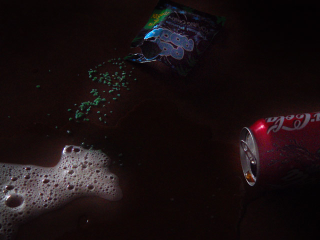
| Why am I still alive. I ate many a pack of pop rocks with sodas. Needs a little more light, especially on the pop rocks and their packagte. The coke can and soda foam can stand alone. Not everyone knows what pop rocks are. This will cost you a couple of points. But then 8 is enough |
|
|
|
11/10/2002 01:31:00 PM |
| wow i love those rock thingies...mmmmmmmm-oh yeah and nice idea-anz |
|
|
|
11/10/2002 10:20:00 AM |
| too dark and shouldn't have items so far apart |
|
|
|
11/08/2002 09:16:00 AM |
| more light! im old enough to remember this one, so i give you a boost in score : ) |
|
|
|
11/07/2002 11:15:00 PM |
|
|
|
11/07/2002 07:16:00 PM |
| Good idea, but the picture is too dark. I can hardly see the pop rocks. Would've been more fun to actually see someon eating/drinking them. |
|
|
|
11/07/2002 08:48:00 AM |
This photo is too dark. I'm not really sold on the composition of it either. That may be because I had a similar idea (great minds think alike :) ). I think the portrayal of this could've been better or at least on this photo, a little more exposure would be a substantial improvement. - Inspzil
|
|
|
|
11/06/2002 09:05:00 PM |
| no way dude thats such a rad feeling. |
|
|
|
11/06/2002 02:50:00 PM |
| cool shot, but needs a lot more light to be totally effective, I think. karmat |
|
|
|
11/06/2002 02:08:00 PM |
| I think that this is just too dark. |
|
|
|
11/05/2002 07:58:00 PM |
| Yes, I totally forgot about this one. Nice choice of superstition. Picture seems a bit dark. Great idea. jacko. |
|
|
|
11/05/2002 04:09:00 PM |
| Good concept, but too dark. |
|
|
|
11/05/2002 08:05:00 AM |
| I like the triangle formed by the objects. The picture should be less dark, because we need to see each more clearly. |
|
|
|
11/05/2002 07:17:00 AM |
| Good photo. Not sure on theme. |
|
|
|
11/04/2002 11:32:00 PM |
| nice idea, but not enough lighting. hard to see. |
|
|
|
11/04/2002 11:26:00 PM |
| Cool idea. I think it may look even better if there was not so much empty space in the middle. |
|
|
|
11/04/2002 08:55:00 PM |
| They still have Pop Rocks?!? Good composition but the Shot appears to be a bit too dark. DPz |
|
|
|
11/04/2002 08:18:00 PM |
A liitle too dark, a light on the pop rocks, and one on the soda, might have helped.
4
Hector |
|
|
|
11/04/2002 03:26:00 PM |
| maybe the darkness of this image is an attempt to set a mood of death? If so, i suppose it works... however, the image 'wow' factor is limited by it... - setzler |
|
|
|
11/04/2002 02:52:00 PM |
| lol I know that one! We ate them anyway. LOL Good job. Shot is a touch too dark for me. Justine 6 |
|
|
|
11/04/2002 12:41:00 PM |
| could be sharper, maybe a bit better lit. |
|
|
|
11/04/2002 11:59:00 AM |
| sigh - I have a problem with pictures that won't load 10 for now. I'll come back tomorrow |
|
|
|
11/04/2002 11:40:00 AM |
| Ha -- forgot about that one! Didn't "Mikey" from the cereal ads supposedly die this way? :) |
|
|
|
11/04/2002 09:27:00 AM |
| Nice concept, not to sure about the execution. I remember this 'urban legend' though :O) Photo would have been better with a little more lite to show off the colors. Creativity is there though... -6- |
|
|
|
11/04/2002 01:18:00 AM |
| Great idea...little too dark. byetko. |
|
Home -
Challenges -
Community -
League -
Photos -
Cameras -
Lenses -
Learn -
Help -
Terms of Use -
Privacy -
Top ^
DPChallenge, and website content and design, Copyright © 2001-2025 Challenging Technologies, LLC.
All digital photo copyrights belong to the photographers and may not be used without permission.
Current Server Time: 03/12/2025 05:38:09 PM EDT.