| Author | Thread |
|
|
04/18/2002 12:07:00 PM |
| I WAS SO TURNED ON I MADE IT MY BACKGROUND AND MADE COPIES TO COVER ABOVE MY BED |
|
|
|
04/15/2002 08:26:00 AM |
| Thanks for all your comments. I have the same criticisms as many of you. I'm still trying to figure out how to control digital. In the end, it came out much darker on dpchallenge than on my computer. Same with the artifacting. Thanks for the encouragement! With such good feedback I'm more interested in figuring this thing out. |
|
Comments Made During the Challenge  |
|
|
04/14/2002 07:19:00 PM |
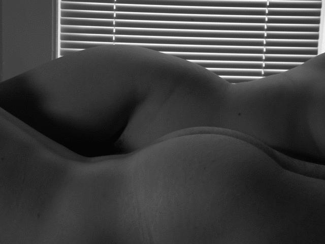
| I do like this shot, but the blinds in the background are very distracting. |
|
|
|
04/14/2002 07:09:00 PM |
|
|
|
04/13/2002 02:31:00 PM |
| Good curves for him and her. I like the blinds. Would have been interesting had the blinds casted shadows on the bodies. I also noticed that the picture is a bit too dark and low in contrast. |
|
|
|
04/13/2002 11:44:00 AM |
| Great use of the lines of the blinds but I wish there was more definition of the front form |
|
|
|
04/13/2002 09:37:00 AM |
| Only one more day until it's revealed just whose arse it really is. As for the shot, I would've chose a different more uniform background. Half wall/half shade doesn't work well in my mind. |
|
|
|
04/12/2002 02:59:00 PM |
| I like the contrast of the blinds in the background, though it's a little lopsided |
|
|
|
04/12/2002 01:02:00 PM |
| Needs just a little more light, but not too much. |
|
|
|
04/11/2002 05:26:00 PM |
| I find the window very distracting. Good Idea, though. |
|
|
|
04/11/2002 07:17:00 AM |
| lighting is weakest element. composition is strong |
|
|
|
04/11/2002 01:01:00 AM |
| Great curves, though it kind of distracts me that the two people are laying head to foot. |
|
|
|
04/10/2002 10:02:00 PM |
Not a bad photo...don't think I would have posed for it.
:) |
|
|
|
04/10/2002 07:50:00 PM |
| I thik this shot would have been alot better if the blinds didn't stop before the edges of the frame. If the light like that could continue from edged to edge it would have looked like really cool studio lighting. As is it is really distracting and takes away from what would otherwise be an outstanding photo. |
|
|
|
04/10/2002 02:24:00 PM |
| Bit dark, and looks to be tilted a little (the blinds could have been centered better, too). But you know why I like this one anyway :) |
|
|
|
04/10/2002 12:45:00 PM |
| all i gotta say is this photo better win |
|
|
|
04/10/2002 12:36:00 PM |
| It's a shame the exposure is so dark, it could have used some more dramatic lighting. |
|
|
|
04/10/2002 10:06:00 AM |
| The AC grid in the background would work a lot better if it were parallel with the edge of the frame and if it ran the full width of the shot. As it is, it doesn't quite look like it's supposed to be there. |
|
|
|
04/10/2002 04:14:00 AM |
| Im a big fan of naked people, but this is just gratuitous, as is the black and white. |
|
|
|
04/09/2002 08:53:00 PM |
| now this is what we all wanted to see |
|
|
|
04/09/2002 01:10:00 PM |
| Love the idea. Great job. |
|
|
|
04/09/2002 12:59:00 PM |
| That took some guts to do. Very attractive and artistic interpretation. |
|
|
|
04/09/2002 12:38:00 PM |
| I'm not a pro (or even close). But if I were doing this shot, I would have tried to get it much sharper and clearer. |
|
|
|
04/09/2002 12:03:00 PM |
| Suble image well composed and exposed. Lines of blind don't do anything for your pic. |
|
|
|
04/09/2002 11:26:00 AM |
| Great idea. The black & white was a good choice, too. A ten for you! |
|
|
|
04/09/2002 09:23:00 AM |
| Might have been a bit better against a consistent background. |
|
|
|
04/09/2002 09:23:00 AM |
| the camera is slightly tilted.. it's very much noticable in the blinds on the window. fantastic shot though. Maybe zoom in a bit, or position your camera differently so the end of the blinds isn't in the picture. |
|
|
|
04/09/2002 07:51:00 AM |
| Very beautiful ! but the blind in the back is distracting so I would crop it right to the top of the girls hip to eliminate the background. |
|
|
|
04/09/2002 07:47:00 AM |
| I think you should have found a different background or at least had the slats straightened. |
|
|
|
04/08/2002 09:28:00 PM |
| good representation and tastefully done. I would crop out the top part of the blinds |
|
|
|
04/08/2002 07:38:00 PM |
| nice juxtaposition. i wish the verticals and horizontals of the blind were more in line with horizon. |
|
|
|
04/08/2002 04:56:00 PM |
| looks a little....exposing |
|
|
|
04/08/2002 04:03:00 PM |
| I like the composition.. Tastefully done in B&W.. |
|
|
|
04/08/2002 03:41:00 PM |
| The lines of lght through the blinds really contrast the 'hers' curves, but the light on the foreground doesn't pick up the 'his' enough to emphasise the different person. |
|
|
|
04/08/2002 02:18:00 PM |
| This is a good photograph but i would like to have seen some lighting to create some more contrast in the image. This photo made my top 20... Score: 6 |
|
|
|
04/08/2002 01:34:00 PM |
|
|
|
04/08/2002 01:06:00 PM |
| nicely done, altho it could use more contrast ...and perhaps just the blinds behind to play off the curves |
|
|
|
04/08/2002 09:48:00 AM |
| good attempt at a difficult subject |
|
|
|
04/08/2002 09:40:00 AM |
| The blinds are distracting to an otherwise nice shot. |
|
|
|
04/08/2002 06:58:00 AM |
| nicely done...very artistic |
|
|
|
04/08/2002 12:24:00 AM |
| I wish I didn't want to mark this down for all the JPEG artifacting, but it's so distracting on this shot. |
|
Home -
Challenges -
Community -
League -
Photos -
Cameras -
Lenses -
Learn -
Help -
Terms of Use -
Privacy -
Top ^
DPChallenge, and website content and design, Copyright © 2001-2025 Challenging Technologies, LLC.
All digital photo copyrights belong to the photographers and may not be used without permission.
Current Server Time: 03/12/2025 07:28:21 PM EDT.