DPChallenge: A Digital Photography Contest You are not logged in. (log in or register
 
Challenge Entries
Portfolio Images
This image is not part of a public portfolio.
Waterfall Kaaterskill Mountain Trail
Gabe1211


Photograph Information Photographer's Comments
Challenge: Trees II (Advanced Editing VII*)
Camera: Sony DSLR-A350
Lens: Sony 75-300 mm f/4.5-5.6
Location: Tannersville, New York
Date: Apr 24, 2009
Aperture: f/13
ISO: 400
Shutter: 1/400
Galleries: Nature
Date Uploaded: Apr 28, 2009

Taken on Mountain hike at top of waterfall.
Developed in Lightroom. Completed in Photoshop.Layered with hard light, color burn, and select range dedicated layers. Cropped about 25% of original photo.

Statistics
Place: 237 out of 263
Avg (all users): 4.5106
Avg (commenters): 3.0000
Avg (participants): 4.4247
Avg (non-participants): 4.5652
Views since voting: 627
Views during voting: 283
Votes: 188
Comments: 4
Favorites: 0


Please log in or register to add your comments!

AuthorThread
05/07/2009 11:02:31 AM
Greetings from the Critique Club!

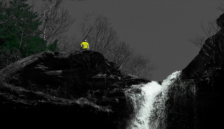
Initial impression: A good in-focus shot, but the yellow shirt really detracts from the waterfall...and both waterfall and shirt detract from the trees.

Technical: Like the pov, clean shot, the shadows help lead the eye up. And there the wheels fall off, because the eye is zinging around from the yellow shirt to the waterfall and finally, to the trees. Not sure if the bright, somewhat flat colours used in trees and shirt help the shot at all.

Artistic: I would say you're trying to do too much here. This is a good shot of a waterfall, so the fact it was entered in Trees makes it look like a bit of a shoehorn. The tree is an afterthought, clinging for dear life to the the far edge of the frame. Interpretation of challenge subjects tends to be quite literal. If need be, go for a fill-the-frame shot.

FWIW: The desat does work well, but having two spots of strong, opposing colours simply doesn't work, and a more natural colour to the trees would have helped. The challenge subject is what we want to see.

Overall not a bad attempt. Read tutorials on this site on composition, or if nothing else, try this: choose a challenge, start at the LAST page, and scroll through to the first page. You'll see the pictures getting stronger in terms of composition and greater use of the KISS principle.

Feel free to PM me with any questions,

Susan
  Photographer found comment helpful.
 Comments Made During the Challenge
05/05/2009 11:47:53 AM
I'm not sure what you're tryin to say with the selective desaturation here.
05/04/2009 07:54:22 PM
the yellow shirt really stands out
  Photographer found comment helpful.
04/29/2009 09:56:44 AM
the bright yellow shirt takes away from the actual subjet challenge...TREES...
  Photographer found comment helpful.


Home - Challenges - Community - League - Photos - Cameras - Lenses - Learn - Help - Terms of Use - Privacy - Top ^
DPChallenge, and website content and design, Copyright © 2001-2025 Challenging Technologies, LLC.
All digital photo copyrights belong to the photographers and may not be used without permission.
Current Server Time: 03/12/2025 08:03:38 PM EDT.