Greetings from the Critique Club!
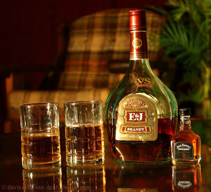
Initial impression: I get tipsy just looking at it :-) would have got a 7 from me in voting because I like the atmosphere here, very cozy and warm.
Technical: Lighting looks ambient and 6 seconds...wow, you really wanted to get the most out of it, esp as you shot at f4. Seems to have been worth it. Tiny little higlights work well too, could well have been glare-y. Comp very simple, but some may not have cared for the chair and fern in the b/g.
Artistic: Hmm...curved table top or truly tilted? Either way i think the slight list is fun and adds to the shot. Like the slight blur/double lettering in the reflection of the JD bottle for same reason.
FWIW: The chair in the b/g may have put some voters off, if they thought it was making the comp cluttered. I do find my eye wandering up the curve of the large bottle to the fern, thence to the easy chair. Just for fun, re-do this pic and black out the chair and fern, see how it changes your shot. Note that I didn't say doing so would necessarily improve your shot; that is your call to make.
Feel free to PM me with any questions,
Susan |