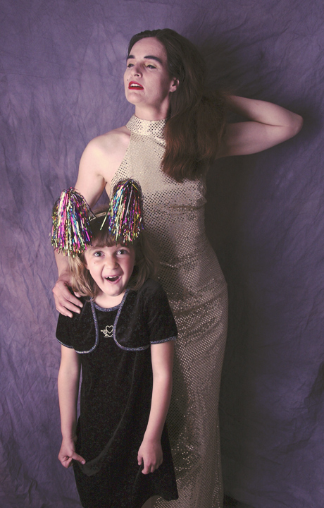
LOL thanks ralph for the loan of your lovely little Sally! What a trooper! :-)
As will soon become apparent, I was the model for Glamour and Grunge for ralph, myself and Quigley. We had tons of fun shooting and Sally wanted in on the shots, so she dressed up and joined in the fun!
Obviously I'm taking a page from Angelina Jolie and having fun mocking her predeliction for adopting children left, right and centre. And Sally is pulling a goofy face and actually does look excited enough that maybe a celebrity has just adopted her! Who's to say? :-)
pp: RAW conversion, curves, levels, crop, layers, deep yellow filter, brightness/contrast, saturation/lightness, resize, usm 2x and sharpen edges 1x, save for web
Statistics
Place: 73 out of 83 Avg (all users): 4.1529 Avg (commenters): 3.3333 Avg (participants): 3.6667 Avg (non-participants): 4.2140 Views since voting: 1486 Views during voting: 563 Votes: 242 Comments: 5 Favorites: 0
Well having been there and seen this shot in the making, I offer you this in observation of your edit. It's really light and unfortunately lacks definition in the people, they don't really stand out from the background. These things are not hard to fix and a look on U-Tube at stuff done by Photoshop Mama would be a big help. You should see what you can do and post a re-edit to compare the two images.
I had a great time visiting you and I really look forward to doing it all again soon.
Well, it's me again Susan! I guess there are not so many people doing critiques at the moment which is why you seem to keep getting me.
When reading your notes about this shot, I'm afraid I have to say, there's nothing obvious, to me at least, that you are mocking Angelina Jolie. I don't follow Hollywood celebrity gossip in any way, shape or form, so definitely did not resonate with me. Therefore, from my perspective there was a very tenuous connection to the challenge.
From a technical point of view, the image seems out of focus to me, well, in any case, very soft. The lighting, as mentioned below, is also quite flat, a boost with levels would have sorted this out for you. (I stand by what I said in my pm, if you want a bit of basic PS help let me know).
Unfortunately the composition is a bit too centered for my taste and the background is a bit too busy. In fact the background seems more in focus than you and Sally. (I appreciate that this is really difficult to take a self portrait - really I do).
I do think that the idea was really creative (even if I didn't get the meaning!), and a few small changes in your set up would surely have given you a higher score.
Looks like a New Year's Eve family photo. If you'd give this a healthy shot of contrast I think it would pop a bit more...seems flat as is. Also, the girls dress pattern looks like digital "noise" at first glance.