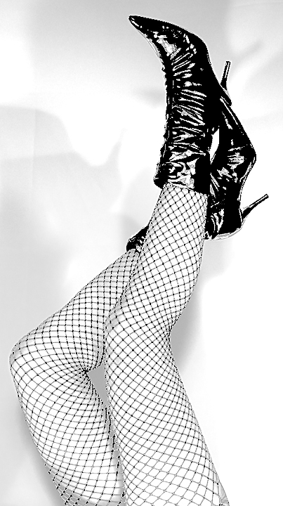
Betty Page was known for light s&m/bondage/fetish shoots in men's magazines back in the 50s. Oh yes, she was also known for her shapely figure and highly stylized, very black bangs. And as some can probably tell by the giant knees, it's me! I got those wonderful boots for all of $5 at a local thrift story, and the fishnets are stockings.
pp: RAW conversion, crop, desat, curves, exposure, contrast, curves and contrast again, resize, usm 3x, save for web
Statistics
Place: 108 out of 253 Avg (all users): 5.6179 Avg (commenters): 5.2500 Avg (participants): 5.3247 Avg (non-participants): 6.1087 Views since voting: 1429 Views during voting: 239 Votes: 123 Comments: 6 Favorites: 0
I like the composition of this shot, it flows nicely and feels complete, as placement of the legs goes I wouldn't change a thing (although I might be inclined to leave a tad more room either side). Your lights positioning however I would change and I would also change your distance from the background to remove the shadows, I'd have placed the main light high camera right and the fill light also fairly high on axis to the camera or slightly left to soften any visible shadows that remained. My reasoning is that I find the shadows distracting from the overall composition.
Technicals:
Considering you obviously used lights of some form on this shot the settings confuse me somewhat, unless you used constant lighting of the table lamp variety I am not sure why you pushed the ISO and had such a slow shutter. I'd be interested to see the original of this to see what it looked like out the camera.
Post-Processing:
I have a feeling I know the kind of look you might have been going for, I've seen this sort of processing on post cards before (normally cheeky images like this) so I will state the following about the PP from a DPC entry perspective only. I think you intentionally hit the contrast to extreme and also the sharpening for the above reasons.
So from a DPC stand point, I think to the voters this would look like an image that has serious sharpening issues, most would also likely look at the banding in the tights (not the legs! :p sorry couldn't resist) and think of it as a processing error rather than give you the benefit of the doubt that you were perhaps going for this look.
My Opinion:
I actually really like this shot (you have great legs!) if you were further from the backdrop and had lit slightly more evenly (to lose the shadows) I think this would make an awesome retro pinup shot that would look stunning poster sized on a wall - I also think that had these two issues been taken care of then the sharpening and contrasts would have worked so much better as the overall look would be MUCH cleaner. Great legs, great pose lets see a re-dux of it soon with those issues ironed out :)
Hope this was of some use, should you wish to discuss any part of the critique further please feel free to PM me.
The classic pinup girl, often copied. Somehow I don't think these are really her legs, considering she passed away recently. Very nice pinup pic nonetheless. Whose legs ARE they? I suppose I will know in a few days.
For me the contrast is way too high. The over all effect is like a badly scanned ink drawing. This is both in the boots and in the stockings. Those pixels where the colour goes into full black really stand out and not in a good way.
I know your processing of the photo was clearly done with a purpose in mind but the overall result I see is a graphic element rather than a photo. It's a fine line to tread and I think you went on the wrong side of it this time around.