| Author | Thread |
|
|
07/29/2009 11:11:53 PM |
CRITIQUE CLUB CRITIQUE
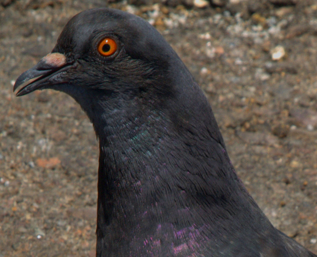
Compostionally, I think you have filled the frame nicely. It gives a nice close up view of the bird. This kind of shot would work well for a documentary type purpose, more than art. Not that either is more valuable or "better" than the other, but they are definitely different.
Technically, the focus is just a hair soft and this close that is very obvious. It could have been any number of things, but in looking at your settings, I would suggest a smaller aperture number (f/8 or 11, maybe) and this would allow you to "speed up" your shutter speed by a couple of stops. This may have let the focus be a bit sharper. The dof is good, and the lighting isn't dramatic, but it is nice and even and that helps.
Overall, it is technically an okay photo, but it feels like it just comes up a bit short. There is nothing that really grabs the viewer and draws him in or makes him compelled to stay with this shot, though the bird does look a touch surprised, if that is possible. More context, or using negative space (a personal favorite of mine, whether effective or not is totally up to you >grin<) may have helped add that little bit of interest that would take this shot up the ranks a bit.
Best to you in future challenges.
Karma
PS -- Something that *might* prove to be effective is to look at the third place picture and yours side by side and do a honest self-evaluation about what make that one better than yours. The pose is nearly the same. This distance is very similar, etc. You had the potential with this "pose," but some of the technicals dropped you down, I think.
Message edited by author 2009-07-29 23:17:29. |
|
 Photographer found comment helpful. Photographer found comment helpful. |
Comments Made During the Challenge  |
|
|
07/28/2009 01:39:17 PM |
| Nothing about this grabs my attention, I'm afraid. May still beat my own, though. |
|
| Photographer found comment helpful. |
|
|
07/28/2009 10:57:59 AM |
| O.K. The center of interest is the eye, and it's not as sharp as the feather texture. Maybe hit the eye with tight sharpening tool, and with a dodge to bring out the color. |
|
| Photographer found comment helpful. |
|
|
07/24/2009 04:19:53 PM |
| The closest I ever want to get to one! |
|
| Photographer found comment helpful. |
|
|
07/23/2009 02:23:53 PM |
| I would have liked to see more sharpness in the pigeons eye and beak area, Just a suggestion - i don't know what your intentions are - but have you tried using an unsharp mask filter + layer mask? |
|
| Photographer found comment helpful. |
|
|
07/22/2009 10:21:35 AM |
| the composition here doesn't really capture my attention... perhaps a different angle or a more interesting crop might help out. Also the colors and contrast seem a bit dull to me, but I'm not sure how that could be fixed. Nice close-up though! :) |
|
| Photographer found comment helpful. |
|
|
07/22/2009 09:35:52 AM |
| Colors seem to be on the dull side. Nothing really jumps out at me. |
|
| Photographer found comment helpful. |
|
|
07/22/2009 05:43:02 AM |
| dull lighting didn't help, although composition is not bad |
|
| Photographer found comment helpful. |
|
|
07/22/2009 04:15:53 AM |
| Heh! He looks like he's smiling for you! |
|
| Photographer found comment helpful. |
Home -
Challenges -
Community -
League -
Photos -
Cameras -
Lenses -
Learn -
Help -
Terms of Use -
Privacy -
Top ^
DPChallenge, and website content and design, Copyright © 2001-2025 Challenging Technologies, LLC.
All digital photo copyrights belong to the photographers and may not be used without permission.
Current Server Time: 03/13/2025 08:30:51 PM EDT.