| Author | Thread |
Comments Made During the Challenge  |
|
|
08/10/2009 01:36:50 PM |
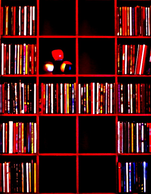
| Could have been pretty decent, but it is severely soft and out of focus. |
|
|
|
08/10/2009 06:20:49 AM |
| I'm not sure if others like the washed out or burnt colours but it prevents me focusing on any one point. |
|
|
|
08/08/2009 11:14:56 PM |
|
|
|
08/05/2009 09:38:40 PM |
| Great idea, but it looks like the post-processing messed up the idea. This image appears to be over saturated, and maybe that was your intent, but it just isn't working for me. |
|
|
|
08/05/2009 11:44:04 AM |
| Nice concept photo of a square. I do find the color to be overwhelming especially the red and the clarity is not sharp. |
|
|
|
08/05/2009 06:43:53 AM |
| Would be great if not out of focus. |
|
|
|
08/05/2009 05:38:44 AM |
| I like the composition, maybe if it was a little straighter though. Not sure what is going on with the colour. |
|
|
|
08/05/2009 02:08:36 AM |
| The coloring on this I think takes away more then helps. |
|
|
|
08/05/2009 01:07:01 AM |
| Too contrasted for my taste, but nice idea. |
|
Home -
Challenges -
Community -
League -
Photos -
Cameras -
Lenses -
Learn -
Help -
Terms of Use -
Privacy -
Top ^
DPChallenge, and website content and design, Copyright © 2001-2025 Challenging Technologies, LLC.
All digital photo copyrights belong to the photographers and may not be used without permission.
Current Server Time: 03/12/2025 09:40:50 AM EDT.