| Author | Thread |
Comments Made During the Challenge  |
|
|
10/26/2009 11:43:14 PM |
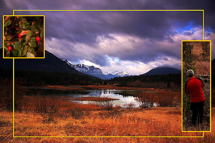
| The main photo is fab, the berries work well, (placing them in the grassy area might have been better) but the person pic seems to detract from the overall image |
|
 Photographer found comment helpful. Photographer found comment helpful. |
|
|
10/25/2009 07:23:50 PM |
| Not wild about that yellow border. Maybe a pencil thin black one would have served you better. That center scene is gorgeous. |
|
| Photographer found comment helpful. |
|
|
10/25/2009 05:16:15 PM |
| Very National Geographic. |
|
| Photographer found comment helpful. |
|
|
10/24/2009 06:07:42 PM |
| Great landscape � personally not that fond of the two smaller images. A 6. |
|
| Photographer found comment helpful. |
|
|
10/23/2009 06:23:48 PM |
| Nice pictures. I'm not sure if the yellow border color compliments them, though. |
|
| Photographer found comment helpful. |
|
|
10/23/2009 12:51:13 AM |
|
| Photographer found comment helpful. |
|
|
10/22/2009 10:42:40 AM |
| A different view at triptych. Great results. |
|
| Photographer found comment helpful. |
|
|
10/21/2009 10:11:09 PM |
| What a spectacular spot! Nice lighting. |
|
| Photographer found comment helpful. |
|
|
10/21/2009 08:45:47 PM |
|
| Photographer found comment helpful. |
|
|
10/21/2009 01:10:22 PM |
| My immediate reaction is that your main image needs rotating to get the trees upright. Nice idea though |
|
| Photographer found comment helpful. |
|
|
10/21/2009 12:10:37 PM |
Beautiful Image. I know it will score high. Keep up the great work.
Tech:
Composition is excellent, colors and contrast are equally excellent, the overall project is put together nicely. Keep up the great work. |
|
| Photographer found comment helpful. |
|
|
10/21/2009 05:53:12 AM |
| I'm quite liking it but not sure why yet... lol will come back for another look later |
|
| Photographer found comment helpful. |
|
|
10/21/2009 03:47:11 AM |
|
| Photographer found comment helpful. |
|
|
10/21/2009 01:06:29 AM |
| the landscape is my favourite part of this image, i almost wish that the other two images werent there to bring it down :( |
|
| Photographer found comment helpful. |
|
|
10/21/2009 12:46:26 AM |
| The border hurts the overall presentation, IMO. Black or white or at least remove the large image border. The photos are nice and the set is otherwise well done. |
|
| Photographer found comment helpful. |
|
|
10/21/2009 12:22:32 AM |
| wow this looks like a post card......cool |
|
| Photographer found comment helpful. |
Home -
Challenges -
Community -
League -
Photos -
Cameras -
Lenses -
Learn -
Help -
Terms of Use -
Privacy -
Top ^
DPChallenge, and website content and design, Copyright © 2001-2025 Challenging Technologies, LLC.
All digital photo copyrights belong to the photographers and may not be used without permission.
Current Server Time: 12/14/2025 02:03:12 PM EST.