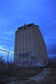
An old abandoned trailer on Brayton Mtn.
Desaturated
Adjusted lightness (Slight)
Adjusted contrast (slight)
Cloned out an annoying plant
Resized
Added border
Statistics
Place: 71 out of 82 Avg (all users): 4.8731 Avg (commenters): 4.7500 Avg (participants): 4.8974 Avg (non-participants): 4.8632 Views since voting: 595 Views during voting: 253 Votes: 134 Comments: 5 Favorites: 0
Here's your Critique from the critique club, as requested! =D
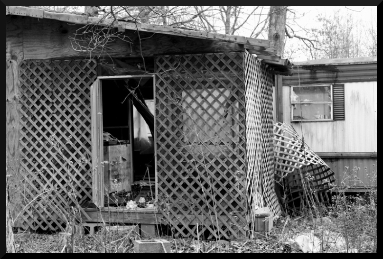
Very interesting photo. I love the rustic metal in the upper-right, the broken window, the log coming down in the shed visible through the door. TO keep these interesting elements the focus of the image, try not to let the sky get blown out above, that's a bit distracting to me and make sure your shot is in-focus when you take the photo. In an editing program such as Photoshop, you might want to try coping down a bit from the top or in from the left to leave out any un-needed image area to help put the focus on the shed, and sharpen with Un-Sharp mask (USM). A little sharpening would help bring out detail in the wood and metal and try getting in closer with your camera to really bring out the dilapidated elements of this scene. Overall the area has lots of potential, so don't give up trying to photograph it. I love the criss-cross of the wooden mesh and how it's falling apart. The image is a bit busy with branches and leaves, but my eye is directed mainly towards the door of the shed, where the open window is blowing through. The contrast there is very appealing and maybe changing your angle so you could see more of the might have raised your score. I'd love to see more detail on the inside and outside of the shed itself, to draw my attention away from the clutter around it. I personally don't think the B&W adds anything to the photo either, and actually detracts from the images detail. What I would have personally done would be to maybe get in closer and present how rustic and dilapidated your subject is at a different and and shorter proximity. The best photos communicate what the subject is very well, The sharper this image is, the more color it has, the more detail it has, and the more you can bring the viewers attention to the shack itself, the better your outcome will be. Try going out again and photographing the inside of the shed with higher contrast, and make dead sure you and the viewer will both know what you're trying to communicate and how run-down this shed is. Hope that helped, and I'd love to see your outtakes and if you decide to go back there, message me. :)
The curtains in the window make me think someone might still live here...
BnW is pretty tricky. I'm not sure this image has enough balance between black, gray, and white to pull it off better than it would in color. There is a lot of gray, and it is all a pretty uniform tone of gray too.
A vignette/dodging and burning would have helped tell the viewer which part of the image you want us to pay attention to. A shallower depth of field would have helped with that too. Since your title is "Watch Your Step," it makes me think you want the view to focus on the cinder block on the ground. Maybe get down to their level, use a shallow depth of field to focus on them, and put the out-of-focus cinder block door step and part of the door frame in the background.
The composition of this is a little messy, nothing really grabs the eye as the subject..........The B&W does not really work for me here....and the crop is very tight