| Author | Thread |
|
|
12/26/2008 08:07:33 PM |
| ooo i like this. it is executed very well |
|
 Photographer found comment helpful. Photographer found comment helpful. |
Comments Made During the Challenge  |
|
|
06/27/2004 09:11:08 AM |
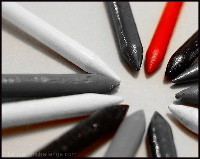
| The pencils should be lined up with more precision, and although you cannot see the other colors, it would be better if there was an even progression of grays among them. |
|
| Photographer found comment helpful. |
|
|
06/23/2004 03:47:33 PM |
| I like the way you compsed this to draw the eye to a focal point. I would have liked it more if the red crayon was in the place of the white one in the upper left corner. |
|
| Photographer found comment helpful. |
|
|
06/21/2004 06:08:52 PM |
| for me this one is one of the greates in the challenge. Nice sharpness, nice black and white, really good compostions and subtle use of the desaturation - 10 This one should really win!! |
|
| Photographer found comment helpful. |
|
|
06/21/2004 02:37:19 AM |
| Not a bad photo, but also not too exciting, leaves me feeling like it could've been better. |
|
| Photographer found comment helpful. |
Home -
Challenges -
Community -
League -
Photos -
Cameras -
Lenses -
Learn -
Help -
Terms of Use -
Privacy -
Top ^
DPChallenge, and website content and design, Copyright © 2001-2025 Challenging Technologies, LLC.
All digital photo copyrights belong to the photographers and may not be used without permission.
Current Server Time: 03/12/2025 07:59:05 AM EDT.