| Author | Thread |
|
|
01/15/2013 02:38:32 PM |
I bet your the kind of guy who puts his elbo out the window when driving. Problem have full cream milk in your beverages too.
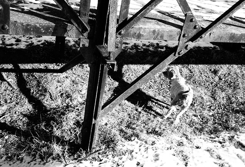
I popped in as a part of tell bombs picked 3 images at random with a commitment to comment on them. The composition leads quickly to the dog so which is pretty good but then the dog is such an anticlimax.
Potentualy thats the point, life is a series of mundane anti-climaxes (is that a word?) |
|
 Photographer found comment helpful. Photographer found comment helpful. |
|
|
02/12/2010 10:44:38 AM |
Gatorguy,
Thank you for your sporting critique of a difficult image. I just wanted to make an academic point about this statement, because I think it's very interesting:
"I think if you flipped it horizontally that same diagonal would lead the eye into the image - just the way our brains work I guess."
This is actually different from one person to the next. It has a lot to do with how we read, left-to-right or right-to-left (Hebrew, e.g.).
In this case, I see the same way you do, and I actually like taking the eye out of the image, though I know that turns a lot of people off. I find that it gives a picture more energy. The image should struggle to get out of its frame. |
|
|
|
02/12/2010 07:14:42 AM |
Critique Club here...
I spent a good deal of time looking at this image trying to figure out what works a what doesn't work (for me).
Works: I am drawn to the gritty, harsh look of this. The hard light and crisp shadows give it kind of a edgy look. I think what I like best, and what creates the most tension in the picture is the disinterested dog.
Doesn't Work: The structure along the top is really distracting. There is no clear focal point for the viewer to hone in on to answer the question "what is the point of this image", but maybe that's not a bad thing either, if someone bothers to enter and look around. The main diagonal leads the eye right out of the image. I think if you flipped it horizontally that same diagonal would lead the eye into the image - just the way our brains work I guess.
I think this would be received better in a gallery than in a challenge like this where you have a but split second to either engage the viewer, or not. If I had voted in this challenge, I probably would have given this a 4 or 5. If I took the time to delve into it as I have now, a 6, maybe a 7.
|
|
| Photographer found comment helpful. |
|
|
02/08/2010 09:15:50 PM |
| And I was your other eight (!). As much as I love Paul and Enzo -- their loss. |
|
| Photographer found comment helpful. |
|
|
02/08/2010 12:21:02 AM |
| I like this for its cinematic qualities & for what's not in the picture, I was one of your 8's. |
|
| Photographer found comment helpful. |
Comments Made During the Challenge  |
|
|
02/07/2010 03:51:39 PM |
I'm going through the entries, stopping at those images I feel have had the benefit of an unconventional eye and dwelling a little longer to try to see and appreciate what you saw. This is one of those images.
Positives: The highlight for me in this image is the shadow of the dog - I like how squared off it is. I also like the texture of the iron work.
Critical stuff: Most of everything else (sorry!) The off vertical structure really bothers me - my problem I know - I tend to be fussy about alignment (always better to align verticals than horizontals I think). The harshness of the contrast -the very bright highlights in the bottom right corner seem unnecessarily harsh to me. The overall composition seems messy too.
Overall: I've been trying to see what you have seen here, but I'm afraid I've failed. |
|
| Photographer found comment helpful. |
|
|
02/07/2010 11:35:51 AM |
| This breaks so many rules, yet it has some innate attraction that defies description. Good work. |
|
| Photographer found comment helpful. |
|
|
02/04/2010 09:51:18 AM |
| ok, Schnauzer Poodle and ??? IMO this is quite blown out with the lighting, you have such loss of detail in this sorry |
|
| Photographer found comment helpful. |
|
|
02/01/2010 03:16:09 AM |
| can't make too much sense of this image |
|
| Photographer found comment helpful. |
Home -
Challenges -
Community -
League -
Photos -
Cameras -
Lenses -
Learn -
Help -
Terms of Use -
Privacy -
Top ^
DPChallenge, and website content and design, Copyright © 2001-2025 Challenging Technologies, LLC.
All digital photo copyrights belong to the photographers and may not be used without permission.
Current Server Time: 03/15/2025 10:16:39 AM EDT.