Here's Your Critique and Feedback as Requested...
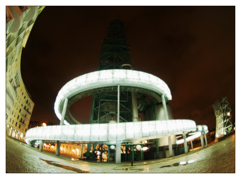
Wow, this is interesting! An odd use of fish-eye but I believe it works. First thing that kinda bothers me (a very minor issue) is that the building itself, as interesting as it is, is kind of difficult to make out form the background as it dissipate into the sky. maybe you were trying to go for this, but I would personally prefer it to be a bit sharper, closer to the camera, brighter, and just a tad bit further away from the bottom edge of the photo. Otherwise, your subject is quite eye-catching in its entirety. It would just settle with me a bit more if I could make out the top edge of the building. The soft-focus and coloring is done VERY well here, I would be surprised you didn't get a higher score had the building been more clearly exaggerated here. Second problem I see, and probably just as important as the first, is your work of framing the subject. Your use of fish-eye works because it wraps the building around the top of the image, framing your subject in the center. I would like this photo a million times better had there been a building to the right that framed your subject to the right side as well, the way the shot is composed, it just doesn't sit right with me.
Other then those minor technical details, I love this image, I really wish it had gotten more approval form the DPC voters. Had the building been sharper, more distinct, brighter and further away from the edge, this photo could have gone up to a 5.5 in my book, and with the a second building framing the subject to the right, this could have easily gotten a 6 or even a 7 from me. Congradz!
Please, feel free to message me if you have any questions! :D
-  ColemanGariety ColemanGariety
The DPChallenge Critique Club |