| Author | Thread |
|
|
03/03/2010 02:05:54 PM |
Greetings from the Critique Club.
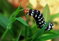
First impressions are that the detail in the shot makes it feel very busy.
Technically it looks like this is oversharpened and that's why the detail is a bit "in your face". The background is quite distracting - could you have shot from an angle to remove the bush from the frame or make it less prominent? DOF seems good.
Artistically I don't know what you were going for here. It's a funky object for sure but this shot doesn't really enhance that. I find myself looking at the reflection a lot - maybe that should have been the focus of your shot?
In summary this comes across as a shot that you didn't put much thought into - try to step back from the shot and ask yourself what you'd vote it and also look for reasons for voters to take points off - because that's what DPC voters do :)
Feel free to PM me if you have any queries.
Gerry |
|
 Photographer found comment helpful. Photographer found comment helpful. |
Comments Made During the Challenge  |
|
|
03/02/2010 08:42:51 AM |
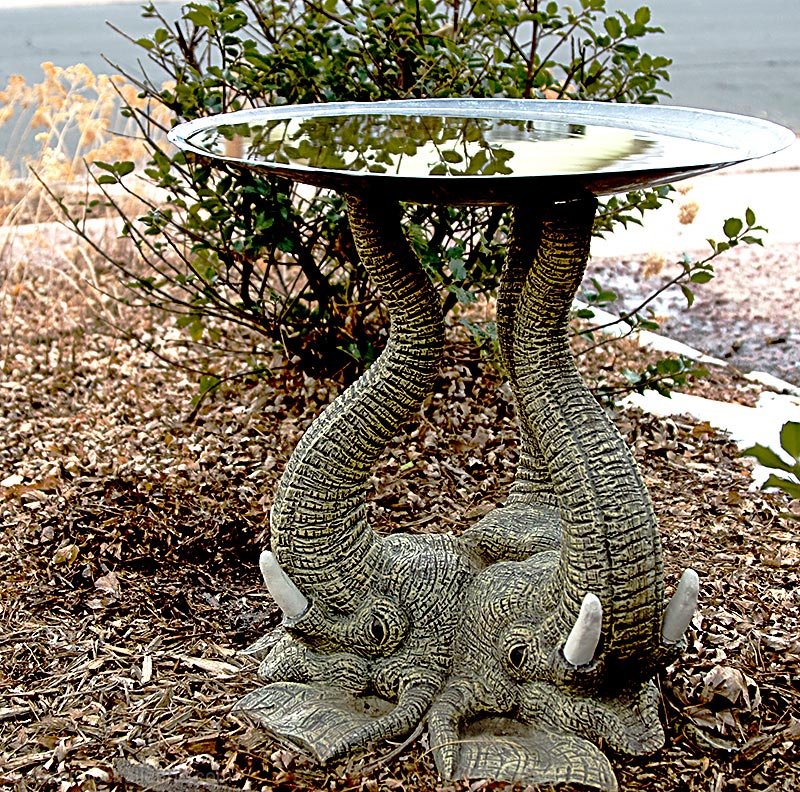
| Unique subject. Would have preferred less BG clutter from a different angle, top down or low down looking up at subject... |
|
| Photographer found comment helpful. |
|
|
03/01/2010 03:41:25 PM |
| Cool subject. Not differentiated enough from background. |
|
| Photographer found comment helpful. |
|
|
02/25/2010 11:36:40 PM |
|
| Photographer found comment helpful. |
|
|
02/24/2010 08:56:11 AM |
| I think you should have just centered this instead of giving it an offset. It is not really using the rule of thirds composition here so a centered composition would have worked. |
|
| Photographer found comment helpful. |
Home -
Challenges -
Community -
League -
Photos -
Cameras -
Lenses -
Learn -
Help -
Terms of Use -
Privacy -
Top ^
DPChallenge, and website content and design, Copyright © 2001-2025 Challenging Technologies, LLC.
All digital photo copyrights belong to the photographers and may not be used without permission.
Current Server Time: 04/02/2025 09:01:58 AM EDT.