| Author | Thread |
Comments Made During the Challenge  |
|
|
03/14/2010 03:45:30 PM |
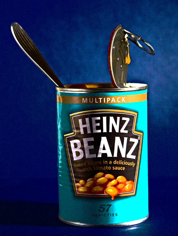
| 3 - The colors aren't enhancing the image in my opinion and for me, this is twofold literal/artistic representation. The drip is good. |
|
 Photographer found comment helpful. Photographer found comment helpful. |
|
|
03/14/2010 10:33:55 AM |
|
| Photographer found comment helpful. |
|
|
03/13/2010 10:58:23 PM |
| Reminds me of a Warhol.....nice.....8 |
|
| Photographer found comment helpful. |
|
|
03/13/2010 11:37:59 AM |
| How can Warhol not come to mind? Even the Pittsburgh connection is here. |
|
| Photographer found comment helpful. |
|
|
03/12/2010 12:36:14 PM |
| A Warhol tribute ehh? I like it! |
|
| Photographer found comment helpful. |
|
|
03/11/2010 02:16:49 PM |
| Maybe I am just not getting it but I have tried and tried and have looked several times at this but it is just missing me. I am sure there may be a cool meaning or something behind this shot but if there is you shot it a bit too far above my head. Sorry, hope you do well. |
|
| Photographer found comment helpful. |
|
|
03/11/2010 08:22:14 AM |
| Interesting. The noise gives it a slight Warhol feel, which doesn't appeal to my artistic tastes (such as they are!) but assuming this was what was shot for - you definitely got it. So good job! |
|
| Photographer found comment helpful. |
|
|
03/10/2010 12:48:50 PM |
| For a minute I thought you might have subtly modified the label but alas no |
|
| Photographer found comment helpful. |
|
|
03/10/2010 11:47:43 AM |
| Shades of Andy Warhol,...Shades of Blue are aesthetically debatable. ;) Simplicity and added grain add to the artistic value, but appears to be fractionally slanted. "6" for ART. :) |
|
| Photographer found comment helpful. |
|
|
03/09/2010 11:51:54 PM |
|
| Photographer found comment helpful. |
|
|
03/09/2010 07:29:34 PM |
| Interesting, far from getting it, I will revisit.. |
|
| Photographer found comment helpful. |
|
|
03/09/2010 05:59:19 PM |
| The drip on the lid is what makes this for me. Almost matches the label! |
|
| Photographer found comment helpful. |
|
|
03/09/2010 04:25:51 PM |
| here is where a noise filter would help out...IMO |
|
|
|
03/09/2010 02:13:17 PM |
| I just love the colours and light. Very vibrant! |
|
| Photographer found comment helpful. |
|
|
03/09/2010 06:51:02 AM |
| Nice. Slightly tipped to the left. |
|
| Photographer found comment helpful. |
|
|
03/09/2010 05:58:49 AM |
| Would I hang it on my wall. Probably not, but still a very interesting picture. However I judge on what I would hang in my apartment. You will have to live with my 6. Maybe later I pump up to a 7. Not sure at the moment. |
|
| Photographer found comment helpful. |
|
|
03/08/2010 10:25:48 PM |
| Ha, ha, I like it. I like the color, the light, the composition, and the idea of eating right from the can. |
|
| Photographer found comment helpful. |
|
|
03/08/2010 12:43:54 PM |
| Nice colors. Much more pleasing then Andy Warhol's Campbell's Soup. |
|
| Photographer found comment helpful. |
|
|
03/08/2010 02:59:30 AM |
| wharhollian i like the punched up colors challenge well interpreted |
|
| Photographer found comment helpful. |
Home -
Challenges -
Community -
League -
Photos -
Cameras -
Lenses -
Learn -
Help -
Terms of Use -
Privacy -
Top ^
DPChallenge, and website content and design, Copyright © 2001-2025 Challenging Technologies, LLC.
All digital photo copyrights belong to the photographers and may not be used without permission.
Current Server Time: 04/26/2025 01:23:07 AM EDT.