| Author | Thread |
|
|
07/08/2004 10:13:01 PM |
from the Critique Club:
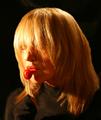
Here you have managed to make a very good composition with an honest expression and a very good feel. The model is relaxed and very credible and his half smile is a winner. Composition=strong. Model=strong.
The weakness which prevented the full delivery is the lighting. Such strong light complicates and contaminates the color channels. Note how yellow predominates on the left and then we are left with red in the shadow. This creates what I call the roasted chicken effect and it is very easy to avoid. To shoot a portrait with unfiltered light is quite a challenge. Check out Cindy in my portraits.
I hand made a few reflectors. Simple wood frame 3 feet by 5 feet and covered them with muslin well stretched, using a staple gun. I bounce my lights of the reflectors. Let us redo your portrait and keep the same identical feel. You do not even need fancy lights. Plain incandescents will do. Place a reflector on the side of the left of the face. Of course, your left is the subjects right. This is your main light. You aim it from the opposite side but keep it as close as possible and about face level. You have a second reflector on his dark side. If you use a similar light of equal strenght you want this light further back than the main. Find the right distance, squinting the eyes help, untill you get the same ratio of contrast. In other words, the main light is boss, this is just a fill. Now, since the subject wears a hat you need to tilt the fill reflector to the oblique happy angle. Do not go too low, we do not want bottom lighting, just enough angle to bring a little light beneath the hat. If you have an extra light you can bounce it off the ceiling. If you use a meter take an incident reading. If you don't, just bracket your exposure. Now, whatever lights you use always remember to tune the white balance. Simply read your manual about shooting a white card.
Your picture will have the same light feel, one side bright and one dark, but not dark enough to hide either features or textures. The coloration will be perfectly balanced with hardly any software adjustment outside of rudimentary levels. Now, if you do not want to make reflectors simply go to art store and get a few sheets of white poster board. You have a good compositional sense and I would cash in on it by the use of reflectors. Besides they come in handy for general tabletop compositions. dan |
|
 Photographer found comment helpful. Photographer found comment helpful. |
|
|
07/06/2004 03:09:15 AM |
Congrats Very nice shot! Only the lighting let ya down a little.
|
|
| Photographer found comment helpful. |
Comments Made During the Challenge  |
|
|
07/04/2004 02:47:54 PM |
I can truly feel the personality here! You did a great job of capturing it. I would like to see just a touch of bounce or fill light on the right side (his left) of his face. Great job.
TC |
|
| Photographer found comment helpful. |
|
|
07/04/2004 02:24:49 PM |
| What a wonderfully colorful subject ! Wonderful facial expression, great tones, the lighting is a little harsh on the side of the face leaving a strong shadow on the other side of the face, other than that I love this shot, it is a delightfully natural image. Congrats! |
|
| Photographer found comment helpful. |
|
|
07/04/2004 11:18:56 AM |
| I'd prefer a little tighter crop to get more attention on the face, maybe even a square. |
|
| Photographer found comment helpful. |
|
|
07/02/2004 11:40:33 AM |
| Wonderful pose. The lighting is a bit harsh and one-sided, however, leaving the face shadowed to the point that many details in his expression are lost. The light right under the brim of his hat kind of blows out the forehead a bit as well. This could be a very good portrait with a few minor lighting adjustments. :o) |
|
| Photographer found comment helpful. |
|
|
07/01/2004 08:42:44 PM |
Lighting: The heavy lighting coming only from his right is causing heavy shadows on his left side; so heavy the eye and features beside the nose are almost lost. A lower amp fill light (or reflector) on his left would have taken care of this, while a difuser on the main light would have been less harsh on his skin tones and prevent the near hot spot on his forhead. The catchlight in his eyes are what save the left half of his face from vanishing into the shadow.
Pose: There is nothing drastically wrong with the pose, it is good; but it could have helped to prevent other problems if done slightly differently. His slouched posture gives him a feeling of being at ease with himself and his surroundings, which is good. However, it also produced the wringles in his clothing that help to accent how strong the light is (again, a fill light could help here).
The tilt of his head is a bit too straight on for my tastes. Having him look slightly more to his right (just enough to hide his right ear) would have moved his face more into the light, without his features casting such harse shadows.
Background: The only thing I would change about the background would be to move him further from it (to get it to blur more), as it is nearly as sharp as he is, which can be a bit distracting. |
|
| Photographer found comment helpful. |
|
|
07/01/2004 05:29:59 PM |
| Good strong lighting but there is an unfortunate shadow cast on the bridge of the nose. Good facial expression. Kinda wish he was sitting up a bit more--though its not too bad for the casual feel of this portrait. I think "plumber" in your title throws it a little out of whack as there's no indication elsewhere of his trade. |
|
| Photographer found comment helpful. |
|
|
07/01/2004 10:45:43 AM |
| Lighting is a bit harsh. Idea and composition excellent. 8 |
|
| Photographer found comment helpful. |
|
|
06/30/2004 11:30:07 PM |
| Nice. Not sure it would help, but moving the background back physically might help blur it a little help it focus attention on the subject a little more. |
|
| Photographer found comment helpful. |
|
|
06/30/2004 08:50:54 PM |
| I believe that if you are going to include "the plumber" you should have had him holding some plumbing tools, If not, I would have left that part out. |
|
| Photographer found comment helpful. |
|
|
06/30/2004 05:50:54 PM |
| Lighting seems off...a bit too strong and 'blinding' |
|
| Photographer found comment helpful. |
|
|
06/30/2004 05:40:10 PM |
| Thought it was Tom Arnold for a second Right side of face is too dark |
|
| Photographer found comment helpful. |
|
|
06/30/2004 01:53:16 PM |
| I think a reflector on the right would have taken away a little of the harshness on the left. The shadows are just a little too dark. |
|
| Photographer found comment helpful. |
|
|
06/30/2004 12:08:05 AM |
| Well - if this was the old "What's my line?" - I never would have guessed plumber. NIce portrait - lighting a bit on the harsh side. Great hat. |
|
| Photographer found comment helpful. |
|
|
06/29/2004 11:55:10 PM |
| I think this is a nice portrait, however the lighting seems a blit too harsh. His hat fades into the background, but the other side is too bright |
|
| Photographer found comment helpful. |
|
|
06/29/2004 07:34:08 PM |
| Great photo .. shows strength. Maybe dodge the left eye a little bit ... |
|
| Photographer found comment helpful. |
|
|
06/29/2004 07:11:01 AM |
| The lights here are not working for me. It needs to be more spread on the face and the shadow on the right side is bothering me. |
|
| Photographer found comment helpful. |
|
|
06/28/2004 10:07:27 PM |
| Some fill-light may have enhanced this image. |
|
| Photographer found comment helpful. |
|
|
06/28/2004 06:41:25 PM |
Roger looks like somebody I know... But he's not called Roger..
Lighting and shadows are a bit harsh...
Nice picture overall |
|
| Photographer found comment helpful. |
|
|
06/28/2004 04:46:18 PM |
I hope your title is not an instruction.
lol
sorry
nice capture |
|
| Photographer found comment helpful. |
|
|
06/28/2004 12:01:58 PM |
| The workin' man! Not bad. The lighting is the weakness here in my opinion. I do like this and wish you good luck in the challenge. |
|
| Photographer found comment helpful. |
|
|
06/28/2004 08:21:04 AM |
| too bad you can't see his face very well because of the shadow and the hat |
|
| Photographer found comment helpful. |
|
|
06/28/2004 07:26:38 AM |
| Hmm, not sure if the lighting was intended for the way it looks but I would've tried to use a fill flash on the right side of his face. It's hard to see the details of his right eyes. The most important think in a studio portrait is the eyes. |
|
| Photographer found comment helpful. |
|
|
06/28/2004 02:11:12 AM |
| The title says he is a plumber, but there is nothing in the picture that confirms that. Lighting seems a bit harsh, maybe if you diffused it with piece of paper, or a sheet of some sort, you wouldn't get such a drastic change of exposure. I do like the expresiion on his face and the posture though. |
|
| Photographer found comment helpful. |
|
|
06/28/2004 01:39:10 AM |
| Looks like his shirt is in sharper focus than his face. I like the quality of the light and the background. |
|
| Photographer found comment helpful. |
Home -
Challenges -
Community -
League -
Photos -
Cameras -
Lenses -
Learn -
Help -
Terms of Use -
Privacy -
Top ^
DPChallenge, and website content and design, Copyright © 2001-2025 Challenging Technologies, LLC.
All digital photo copyrights belong to the photographers and may not be used without permission.
Current Server Time: 03/12/2025 11:23:37 PM EDT.