| Author | Thread |
|
|
07/08/2004 09:17:50 PM |
Greetings from the Critique Club!
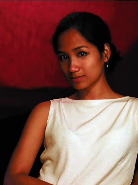
The message
A beautiful painting-style portrait of a woman who seems intelligent and mysterious as well as attractive.
Creative choices
The red background really brings out the model's skin color. The simple top is wrinkled just right to give a classic "draped" look, although the outline of her bra showing through add a modern touch. The digital noise is effective here, adding to the painted look.
Technical aspects
Focus is fine. Exposure was dark, but adequately saved with Photoshop. The color around the edge of her hair seems off, but is otherwise great. |
|
Comments Made During the Challenge  |
|
|
07/04/2004 02:31:09 PM |
Very warm tones. Background and her skin tones compliment each other nicely. The lighting is a touch dark for MY taste, but still very well done. You have a nice sense of depth and you captured the folds in her blouse nicely!
TC |
|
|
|
07/02/2004 11:18:09 PM |
| I really like the combination of tones and texture -- reminds me a lot of an oil painting. |
|
|
|
07/02/2004 12:33:30 PM |
| Good pose and expression and I find the soft effect and colors of this image to be quite artisitc. Atomosphere is good but I wish the skin tones looked more natural. |
|
|
|
07/02/2004 10:10:28 AM |
| Such a beautiful model. The contrasts between the blouse and the dark surroundings creates a bit of a distraction to me. Maybe more light for the BG or a more muted color for her blouse? Her face is shadowed heavily on its right side. I think that with a lighting adjustment, this could be a beautiful portrait. :o) |
|
|
|
07/01/2004 04:29:58 PM |
Lighting: While you have a nice catchlight in her eyes, a small backlight aimed at the back of her head would have provided some very needed separation between her dark hair and the dark background. The lack of detail, color shift and banding (hair mainly) in the dark areas suggests this was underexposed and then lightened during post-processing. The right side of her face needs a fill light to counteract the harsh shadows.
Pose: The pose is nice, very well executed. However, it was likely not the best pose for her choice of clothing. With her leaning back as she is, the shirt falls too heavily on her undergarment providing some very distracting lines to an otherwise excellent draping of the fabric. Finally, on a related note, the tight cropping on the left (removing her arm) is undesirable.
Background: There is not enough detail left in the background to say more than I mentioned above, except that a lighter background would have bounced light back on the model, helping to light her, instead of pulling the light from her.
A shot with a lot of potential lost due to what appears to be low lighting. |
|
|
|
07/01/2004 01:12:08 PM |
| Nice red tones. Like the softness.8 |
|
|
|
07/01/2004 07:08:29 AM |
| Wow wow ! the posing is perfect and the color saturation and contrast rock. I love this one . Jacko. 10 |
|
|
|
06/30/2004 12:41:38 PM |
| Very pretty...just a little too dark on one side of her face. |
|
|
|
06/30/2004 09:17:42 AM |
| Very pretty woman. Her hairline looks a little wierd (photoshop maybe) and the background is strange. Pretty eyes. |
|
|
|
06/30/2004 01:20:07 AM |
| This is definitely a WOW! Outstanding 10 |
|
|
|
06/29/2004 09:37:31 PM |
| Charming model with excellent expression. Focus seems a bit soft. |
|
|
|
06/29/2004 07:40:37 PM |
| The lighting seems off, white balance doesn;t seem right. Your eye is drawn to the bright white dress distracting you from looking at the face. |
|
|
|
06/29/2004 05:05:29 PM |
| oversaturated..still an 8 |
|
|
|
06/29/2004 03:28:26 PM |
| it has a great paint like quality......I like it |
|
|
|
06/29/2004 01:53:26 PM |
| Striking model, color, and compostion. A little more light on the left side of the face and neck would help some. The light on her face needs to be just a bit more diffuse also. |
|
|
|
06/29/2004 05:36:52 AM |
| Better lighting would've helped this photo. Lots of dark areas. |
|
|
|
06/29/2004 01:40:19 AM |
|
|
|
06/29/2004 01:10:37 AM |
| Some lighting to highlight the face, because her blouse stands out as the predominant feature. |
|
|
|
06/28/2004 09:31:04 PM |
| Looks almost like a painting. Very beautiful photo. |
|
|
|
06/28/2004 04:41:36 PM |
really nice skin tones here.
I feel that a little backlight would have helped to make your model stand out from the background.Good luck |
|
|
|
06/28/2004 04:41:20 PM |
| too dark for my taste, could have been bery strong with better lighting! |
|
|
|
06/28/2004 01:47:41 PM |
| great colours....nice use of the deep red background to compliment your model's skin tones. Good composition....Great work. |
|
|
|
06/28/2004 01:05:20 PM |
| Nice portrait but....The face is a bit to dark on one side and it's a bit out of focus. |
|
|
|
06/28/2004 11:59:03 AM |
| Lovely girl, looks like a painting. I like the pose, just needs a bit more light on her pretty face. Over all nice work!! |
|
|
|
06/28/2004 08:09:02 AM |
| maybe you did this on purpose, but the out of focus doesn't work for me |
|
|
|
06/28/2004 08:06:16 AM |
| Stunning. The lighting works really well with the girl's dark complexion. |
|
|
|
06/28/2004 02:14:09 AM |
| Like the model, she goes well with the low-key style of this shot. I'm guessing you intended the focus to be soft- it's not quite as effective as it could be. |
|
Home -
Challenges -
Community -
League -
Photos -
Cameras -
Lenses -
Learn -
Help -
Terms of Use -
Privacy -
Top ^
DPChallenge, and website content and design, Copyright © 2001-2025 Challenging Technologies, LLC.
All digital photo copyrights belong to the photographers and may not be used without permission.
Current Server Time: 03/12/2025 02:20:17 PM EDT.