| Author | Thread |
|
|
04/12/2010 09:37:37 AM |
| I just find it funny and there are examples of this all over the comments of photos where one voter likes one aspect of the photo and another doesn't like the same aspect of the photo... in this case the textured background. How do you please all the people all the time??? lol. |
|
 Photographer found comment helpful. Photographer found comment helpful. |
Comments Made During the Challenge  |
|
|
04/11/2010 11:57:00 PM |
| i hope this isn't underappreciated. nice work. |
|
| Photographer found comment helpful. |
|
|
04/11/2010 11:20:29 AM |
| nice concept but too tight a crop |
|
| Photographer found comment helpful. |
|
|
04/11/2010 01:45:36 AM |
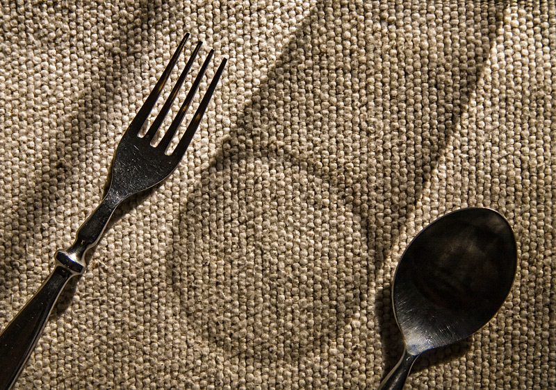
| nicely lit, but the shadow on the left of the fork is a bit distracting |
|
| Photographer found comment helpful. |
|
|
04/10/2010 11:40:21 PM |
In an image that derives a great deal of its energy and impact from the shadow of the glass, the shadow to the left of the fork running diagonally through the picture is a major distraction. The good thing is that the remainder of the picture is almost strong enough to keep your eye away from that eye (but not quite). Because the silverware looks so dark, it isn't very appetizing to think of using it to eat.
For me, this is a compelling picture. Creative, simple, mixed textures, nice tones. |
|
| Photographer found comment helpful. |
|
|
04/10/2010 01:24:24 PM |
|
| Photographer found comment helpful. |
|
|
04/09/2010 06:49:01 AM |
| I like that the shadow of the glas is in the picture. Really nice composition. |
|
| Photographer found comment helpful. |
|
|
04/07/2010 01:32:55 PM |
| well done...I like the shadow of the glass... |
|
| Photographer found comment helpful. |
|
|
04/07/2010 09:12:53 AM |
|
| Photographer found comment helpful. |
|
|
04/06/2010 07:07:18 PM |
| I actually like this shot. It took me a few seconds to change my mind but now I think it is nice. I guess the part that makes it work is the texture of the background. |
|
| Photographer found comment helpful. |
|
|
04/06/2010 12:39:19 AM |
|
| Photographer found comment helpful. |
|
|
04/05/2010 07:49:10 PM |
| Good study of light and shadows. It oculd benefit from a less textured background that is not a neutral color. |
|
| Photographer found comment helpful. |
|
|
04/05/2010 03:27:36 PM |
3 clear elements and I like your idea. The shadow glass is very nice.
I do think that the shadow line next to the fork should be removed. It sort of adds a fourth element to the picture and is distracting. |
|
| Photographer found comment helpful. |
|
|
04/05/2010 11:38:26 AM |
| This misses the equal visual importance thing for me. 5 |
|
| Photographer found comment helpful. |
|
|
04/05/2010 04:53:48 AM |
| hehe,,, like,,,,,,,,,,6 |
|
| Photographer found comment helpful. |
|
|
04/05/2010 12:15:23 AM |
| Cool idea. Fun to work it out, visually. Love the angle and narrow color band. |
|
| Photographer found comment helpful. |
Home -
Challenges -
Community -
League -
Photos -
Cameras -
Lenses -
Learn -
Help -
Terms of Use -
Privacy -
Top ^
DPChallenge, and website content and design, Copyright © 2001-2025 Challenging Technologies, LLC.
All digital photo copyrights belong to the photographers and may not be used without permission.
Current Server Time: 04/02/2025 04:18:11 AM EDT.