| Author | Thread |
|
|
12/02/2002 11:30:00 AM |
#95
Critique Club Assignment
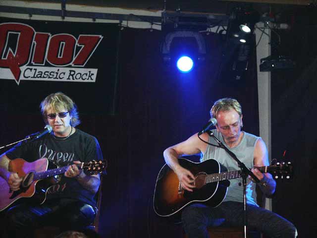
I like the perspective.
Usually two guys on stage are shot from a low position, below the stage or people try to get right in the middle of them. Here the photographer has us off to the side but at the same height or a little higher. I think it works well.
The composition is weak. We have 3/4 of the guy on the left, his arm is cut off. Also the sign Q107 is only partially seen. I think the crop could of improved this shot. Also the photo appears to be over sharpened to me. Maybe it's the camera, or the lights?
It's a night shot. They can be hard to pull off with strange lights. This shot is not bad, it just has a few fixable flaws. With a little adjustment this could be their next album cover!
|
|
Comments Made During the Challenge  |
|
|
12/01/2002 01:28:00 PM |
| If you cut this shot in half you have a much better picture. The left hand side doesn't appeal to me at all and detracts from the overall image. Otherwise a decent shot. I like the spotlight! |
|
|
|
12/01/2002 09:46:00 AM |
| Go leafs go, baby!!! Is this at the Horseshoe? ....that spotlight is too bright and distracting....9 |
|
|
|
11/30/2002 07:29:00 PM |
| Good concert night shot, especially spot light . Nice gocus. Focus a little tight on left, with room on right to move it over, which would also have shown all of the "Q". This is a small thing but it's these small things that make the difference between a good shot and a great shot- paying attention to details. This is a good shot and would make one want to read the article about the concert. PTL8 |
|
|
|
11/29/2002 04:30:00 AM |
| Looks like a couple guys from Def Leppard, Joe Elliot and Phil Collen, but I could be wrong here. If it is, what a great op for a pic. Lighting is pretty cool. Pic is framed a little weird, looks like it could be panned back a bit to include more of left guys guitar. Overal pretty good though. - Inspzil |
|
|
|
11/28/2002 11:18:00 AM |
| man, those guys are giving it their all! Just kidding :) great capture in the circumstances. too bad the musicians are so static. |
|
|
|
11/25/2002 02:17:00 PM |
| Crop could of been better here and it's a bit fuzzy/blur. However the shot is sure on topic, and it's interesting to look at. I like it. Justine |
|
|
|
11/25/2002 01:06:00 PM |
| I would like this image better if the cropping was less awkward. |
|
|
|
11/25/2002 10:00:00 AM |
Composition: Subject Placement, Cropping, Background7,
Technical: Focus, Exposure, Lighting, Processing6,
Appeal: Is it Interesting, Motivating, Etc.? 5,
Total Averaged Rating6. Autool
IMO the relationship between the title and picture are key elements in this challenge. I guess I would need to be a local to get the connection. You had bad conditions to make this picture in, but I would have liked to see the whole sign for the radio station, and less of the blaring light.
|
|
|
|
11/25/2002 09:07:00 AM |
| Framing is off just a tad. Good ability to capture a low light situation. |
|
|
|
11/25/2002 02:42:00 AM |
| Although it seems painfully obvious to us... few people actually know what TO stands for. Interesting composition. |
|
Home -
Challenges -
Community -
League -
Photos -
Cameras -
Lenses -
Learn -
Help -
Terms of Use -
Privacy -
Top ^
DPChallenge, and website content and design, Copyright © 2001-2025 Challenging Technologies, LLC.
All digital photo copyrights belong to the photographers and may not be used without permission.
Current Server Time: 03/12/2025 10:30:31 PM EDT.