| Author | Thread |
|
|
12/08/2002 06:20:59 PM |
Critique Club Comment ~ Mike (MyQyl) Clark
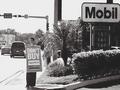
Composition : Strong use of framing with the factory framed by the color of the turning leaves. The clock is positioned well for the 'rule of thirds' and the time on the clock (4:40) adds to the feeling you wanted to convey. It's almost quiting time, if you like it or not.
Exposure/Lighting : The somber, grey feel expresses what you wanted to say well. It just doesn't help much for a photograph. But I think what you were saying is more important to this picture then an eye pleasing exposure would have been.
Focus : The leaves in the forefront are very soft, but I assume you chose to do it since you used F2.8... Personally I'd like to see what would have resulted from a longer exposure with a greater DoF.
Emotion/Challenge : I can certainly see this accompanying an article like you described, but without that description, I had a hard time making the connection. While many folks claim titles shouldn't be considered, I think a more descriptive 'headline' may have helped... 'Small Town Plant Closure' or something similar might have given people more connection with the shot. Emotionally this is very strong.
Post Production : I'm curious if the grey-scale on the building is a result of the day or of turning down certain channels. Either way, it's well done.
|
|
 Photographer found comment helpful. Photographer found comment helpful. |
Comments Made During the Challenge  |
|
|
12/01/2002 07:06:00 PM |
| how does one get color & greyscale in the smme photo? |
|
| Photographer found comment helpful. |
|
|
11/30/2002 05:03:00 PM |
| I like the contrast of the fall folliage and the grey background..feels depressing |
|
| Photographer found comment helpful. |
|
|
11/30/2002 12:28:00 AM |
| This is my personal opinion but the out of focus leaves on theleft do not add to this one. I do not loke the colorization in the photo. Should be natural when in a rural setting such as this. This doesn't appeal to me or stir up any interest. Like I said, that's my opinion. PTL3 |
|
| Photographer found comment helpful. |
|
|
11/28/2002 04:53:00 PM |
| I really like the way you used the leaves/trees to frame your shot. Makes me think a newspaper photographer was sneaking around this factory in the bushes when he/she captured the shot. Very creative. 8 |
|
| Photographer found comment helpful. |
|
|
11/27/2002 11:09:00 PM |
| Did you do something to the shot to make it look like this? The trees are really colorful, and the rest is so blah. Really says something about the pollution in the air. It feels a little cut off at the bottom maybe as far as composition goes. I actually like factory shots. I'm wanting to try one at night with a slow shutter to blur the smoke. Soon as a get a big body guard to go with me.... Anyway, fits the challenge. Not as strong as some of the other shots, but not bad. :o) ~indi |
|
| Photographer found comment helpful. |
|
|
11/27/2002 09:10:00 PM |
|
| Photographer found comment helpful. |
|
|
11/27/2002 04:25:00 PM |
| The effect is nice, but I think it needs a contrast adjustment. The photo is too dark and seems flat. |
|
| Photographer found comment helpful. |
|
|
11/27/2002 10:26:00 AM |
| The shots of color are nice, but it doesn't seem like any one part of this photo is in focus. Perhaps focusing more on the factory (and blurring the leaves in the foreground even more) would have more oomph to it. muckpond |
|
| Photographer found comment helpful. |
|
|
11/26/2002 12:44:00 PM |
| Very good you have captured a grey and dreary atmosphere well counterpointed by the red of the leaves andrewm |
|
| Photographer found comment helpful. |
|
|
11/25/2002 11:10:00 PM |
| This picture gives me some mixed feelings. I like the subjects in distance. Greyscale is effective here. The angle makes the clock and the tower on the right the same distance to the center tower. This bit of colorful leaves, although adding a bit of color, not to mention probably a definite part of the composition is very distracting. NOTE: If this was not your intention for this photo disregard what is to follow. I'm seeing this as a little paradox - the beauty and color of nature vs. the greyscaled industrial factions. If this is the case, I would've found it much more effective to put the focus on the foreground leaves vs. the buildings in the background. Leave those out of focus to let your viewer know that your aim was to focus on the leaves. This is just my opinion. If the leaves have nothing to do with the shot in your initial intent, then leave them out as they are completely distracting. Good Luck - Inspzil |
|
| Photographer found comment helpful. |
|
|
11/25/2002 06:28:00 PM |
| I like the effect of the colored leaves in the foreground and the gray middle and background, but the view of the factory itself doesn't grab me or interest me much. 5 |
|
| Photographer found comment helpful. |
|
|
11/25/2002 05:51:00 PM |
| Looks like a place where I grew up...like the color contrast...little blurry...maybe someone around ya can give ya a couple of tips |
|
| Photographer found comment helpful. |
|
|
11/25/2002 10:22:00 AM |
Composition: Subject Placement, Cropping, Background7,
Technical: Focus, Exposure, Lighting, Processing6,
Appeal: Is it Interesting, Motivating, Etc.? 7,
Total Averaged Rating7. Autool
IMO the relationship between the title and picture are key elements in this challenge. You have captured the moment, but where is the sun when you need it? A little better exposure would have made this picture much stronger for me.
|
|
| Photographer found comment helpful. |
Home -
Challenges -
Community -
League -
Photos -
Cameras -
Lenses -
Learn -
Help -
Terms of Use -
Privacy -
Top ^
DPChallenge, and website content and design, Copyright © 2001-2025 Challenging Technologies, LLC.
All digital photo copyrights belong to the photographers and may not be used without permission.
Current Server Time: 03/12/2025 04:25:44 PM EDT.