| Author | Thread |
|
|
07/12/2003 10:29:24 PM |
| this is a brilliant shot. Algning it to the left is perfect. Have you tried it with the eye as well? |
|
 Photographer found comment helpful. Photographer found comment helpful. |
|
|
12/08/2002 12:45:36 PM |
Thank you very much Kavey. You did a fine job. You are much appreciated.
John(TurboTech) :-)
Message edited by author 2002-12-08 12:45:57. |
|
|
|
12/05/2002 11:31:38 AM |
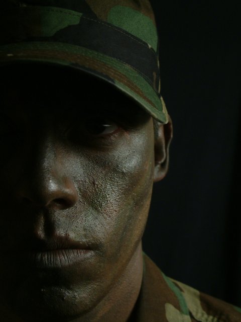
Critique Club
Initial thoughts
Emotive content, image seems very dark.
Composition/ Content
I like the off-centred composition and the way the face is cropped but not completely halved. Including the cap/hat and only a little of the shirt clarified that the man is a solder without losing focus on his face. Content is stark and uncompromising, which fits the title and is therefore clearly deliberate.
Focal point is confusing. There is just enough detail in the eye that I am drawn to it but not enough to satisfy so it is not the focal point it could be. I think perhaps the eye needs to be either wholly in shadow or a little more in the light. An alternative focal point might be the mouth but the highlights which are stronger on the cheek don�t tend to encourage that. Therefore the focal point seems to be his nose and the highlights on his cheek.
Background
Clean black does not detract from the subject but also doesn�t allow the subject to stand out from it. This may be deliberate � it does bleed into the shadows well but does not work for me, personally.
Camera Work - Technical
Focus seems good on the face, a little soft on his shirt. Exposure and lighting are probably deliberate but just a bit too dark for me.
Digital Processing - Technical
Cant see any artifacts, seems fine to me.
Fits The Challenge
Yes, given the current political/ military situation in the US � perhaps there is a cloud hanging over the future or this soldier � he has the resolve � will he be called on etc. There could certainly be a story there.
Your Opinion On The Photo
The photo seems well taken � in that I believe it looks as it was intended to by the photographer. It doesn�t sit well with me partly because of personal politics and partly because it�s too dark visually for me.
Message edited by author 2002-12-06 13:58:03. |
|
|
|
12/02/2002 07:20:00 AM |
| That is a very nice example of low key photography. The only thing that would improve it is a little more detail over on the left. Very nice job! Congrats! |
|
|
|
12/02/2002 12:19:00 AM |
Well everyone. Thank you for the votes. I really appreciated them. I guess since the model in the picture was me, I did a darn good job of getting tenth. Hard to take a picture when you are in front of the Camera and there is no one to press the shutter. That is why the eye came out so dark. I was satisfied with the picture. :-)
TurboTech |
|
Comments Made During the Challenge  |
|
|
12/01/2002 08:40:00 PM |
|
|
|
12/01/2002 06:30:00 PM |
| Having been a Marine myself, this is a very familiar look. Good comosition. Having one eye out of frame and the other slightly concealed was a good touch. |
|
|
|
12/01/2002 04:26:00 PM |
| I do like this, but to me it's a touch underexposed. The visor on the hat throws a shadow over his eyes that's just too deep, so we're left with half an eye. I either want to see his eye properly, or not at all. Hard to explain... |
|
|
|
11/30/2002 05:17:00 PM |
|
|
|
11/30/2002 05:01:00 PM |
| very powerful..would make a good Army poster |
|
|
|
11/30/2002 02:56:00 PM |
| Great portrait. I like the crop and the colours, the shadows. Very well done, this one will be up there in the top 3. |
|
|
|
11/30/2002 12:02:00 PM |
| I usually rate blantant U.S. patriotism low, but this is a great photo. 7 of 10. Would have been 9 of 10 with better contrast. Too much shadow around the eyes. |
|
|
|
11/29/2002 03:51:00 PM |
| Great expression, but too dark. |
|
|
|
11/29/2002 01:00:00 PM |
| Nice shot. A little more exposed wouldn't have hurt, though. |
|
|
|
11/29/2002 05:23:00 AM |
| Looks more like advertising that photojournalism. Really dark too which is not helping. It's hard to tell he's in camo even. - Inspzil |
|
|
|
11/28/2002 11:48:00 PM |
| it is unfortunate the eye were cleared. otherwise it would be perfect. Just personal taste! |
|
|
|
11/28/2002 09:55:00 PM |
| hahahaha military guys are great at holding still aren't they. nice nice portrait, you should totally send a copy to the joint chiefs. |
|
|
|
11/28/2002 09:11:00 PM |
| Nice shot. I like your choice of an off centre shot. Jacko 8 |
|
|
|
11/28/2002 04:04:00 PM |
| This is a TIME cover. Great job, my pick for first place. 10 rcrawford |
|
|
|
11/28/2002 11:02:00 AM |
| Good picture! But I thinks it needs a little more light. |
|
|
|
11/28/2002 12:48:00 AM |
| Thought provoking. Nice clarity. |
|
|
|
11/27/2002 04:12:00 PM |
| the strength of this shot in your model, offset angle, tone, and lighting create the perfect shot for front of editiorial page. emotive shot...fantastic! (10) ~mcmurma |
|
|
|
11/27/2002 02:06:00 PM |
| Cool Shot. Very interesting! |
|
|
|
11/27/2002 01:04:00 PM |
| Excellent shot! Definitely a contender for the top this week... ~ MyQyl ~ |
|
|
|
11/27/2002 12:23:00 PM |
| Excellent but a LITTLE dark. Maybe one stop. 9 nards656 |
|
|
|
11/27/2002 08:47:00 AM |
| It's a great photo - very well done portrait! For me maybe a bit too dark - on one hand - on the contrary it give's it the wow factor... maybe it would have been better, if I could see the eye... but nevertheless, it's a great pic! 8 - KAOS |
|
|
|
11/27/2002 12:12:00 AM |
| Great shot. He looks serious. I love the composition looks almost like a poster. 9. byetko. |
|
|
|
11/26/2002 09:55:00 PM |
| looks more like resignation than resolve, maybe because the eyes are shadowed. |
|
|
|
11/26/2002 09:08:00 PM |
| Thats a good one and really fits the theme. love the lighting +9 KL |
|
|
|
11/26/2002 08:49:00 PM |
| Very strong and powerful image, wonderful composition. I think that a little more light on the eye would be good, but I also like the way you have done it. |
|
|
|
11/26/2002 08:27:00 PM |
| The composition and idea here is really good, but it would benefit from a little more lighting. It looks underexposed. |
|
|
|
11/26/2002 12:34:00 PM |
| A powerful portrait well done andrewm |
|
|
|
11/26/2002 09:19:00 AM |
| Would have preferred this just a touch lighter. Good picture though. |
|
|
|
11/26/2002 07:33:00 AM |
| I like his expression and detail on his face I would give this photo more brighhtness. |
|
|
|
11/25/2002 10:39:00 PM |
| Very strong image. Fits the challenge. Only technical problem I see is the lighting. Having one side of the face dark is dramatic, but having the eye dark is a little bothersome. Good work & good luck. Nice title btw. ~indigo997 |
|
|
|
11/25/2002 09:48:00 PM |
| I would have liked to have seen more of the eye!...Good image though |
|
|
|
11/25/2002 06:21:00 PM |
| I would like to see a little more light on the eye. |
|
|
|
11/25/2002 06:14:00 PM |
| Totally cool. I love the whole thing.......just one little thing...it could of been a tad bit lighter. Still it's soooooooooooo cool. Great job. Justine |
|
|
|
11/25/2002 05:45:00 PM |
| feels like an uncle Sam adv. it fits though |
|
|
|
11/25/2002 04:09:00 PM |
| Great Time/Life/Newsweek magazine cover! |
|
|
|
11/25/2002 03:41:00 PM |
| Good pic, a little dark - no story being told here. PhotoJOURNALISM. |
|
|
|
11/25/2002 01:55:00 PM |
| Dark and cool, great job:) |
|
|
|
11/25/2002 01:45:00 PM |
| Too good for a newspaper - this looks straight off the cover of a magazine. Excellent. |
|
|
|
11/25/2002 11:56:00 AM |
| Is the picture this dark or did it get a little darker when you changed the file? It is a cool pic, I just wish there was more light like on his hat or shirt. I like the light on his face. |
|
|
|
11/25/2002 10:56:00 AM |
| To dark for print but good idea. |
|
|
|
11/25/2002 10:03:00 AM |
Composition: Subject Placement, Cropping, Background9,
Technical: Focus, Exposure, Lighting, Processing8,
Appeal: Is it Interesting, Motivating, Etc.? 10,
Total Averaged Rating9. Autool
IMO the relationship between the title and picture are key elements in this challenge. This is a powerful, telling picture. I think a little more of the eye would have made it go over the top. Very nice.
|
|
|
|
11/25/2002 09:56:00 AM |
| Great shot but a little too dark. Would like to have seen the eyes - the windows to the soul - because they would have put the fnish to his great expression. The expression makes the picture. Wish it were lighter. Still good shot. PTL7 |
|
|
|
11/25/2002 08:50:00 AM |
| good pic, although it is far too dark for my liking.. 6 |
|
|
|
11/25/2002 03:52:00 AM |
| I instantly thought: This is a cover! |
|
|
|
11/25/2002 02:15:00 AM |
| Good shot, nice lighting, next time try to show more of the eye for portrait shot like this one, it will make it a lot stronger |
|
|
|
11/25/2002 01:10:00 AM |
| Wonderful! This shot belongs on the cover of a magazine for sure! I just wish there was a little more light showing his eyes. But this is a solid 9! GREAT JOB! |
|
| Photographer found comment helpful. |
|
|
11/25/2002 12:47:00 AM |
| Excellent, gave it a 10 kandyj |
|
| Photographer found comment helpful. |
|
|
11/25/2002 12:36:00 AM |
| AWESOME !!!!!!!!!!!!! = 10 Shiiizzzam |
|
| Photographer found comment helpful. |
|
|
11/25/2002 12:31:00 AM |
| I like this photo a lot, but I'd like to see more light on the eye. Still a 9, though. |
|
| Photographer found comment helpful. |
Home -
Challenges -
Community -
League -
Photos -
Cameras -
Lenses -
Learn -
Help -
Terms of Use -
Privacy -
Top ^
DPChallenge, and website content and design, Copyright © 2001-2025 Challenging Technologies, LLC.
All digital photo copyrights belong to the photographers and may not be used without permission.
Current Server Time: 03/12/2025 08:59:29 PM EDT.