| Author | Thread |
|
|
03/04/2011 07:35:18 AM |
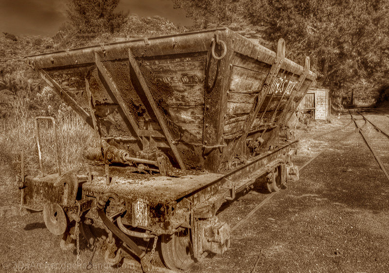
| Your choice to convert to sepia really helped this shot vis-a-vis the challenge. Both are good - the sepia version really fits better, though. |
|
 Photographer found comment helpful. Photographer found comment helpful. |
Comments Made During the Challenge  |
|
|
07/17/2010 02:53:40 AM |
| I'd like to see more contrast. |
|
| Photographer found comment helpful. |
|
|
07/15/2010 08:59:26 AM |
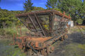
| Looks like old poster in the museum. |
|
| Photographer found comment helpful. |
|
|
07/13/2010 08:16:48 PM |
| I like the bold sepia effect not so much to create a vintage photo feel (which I think it is too bright for that) but because it gives the image a surreal effect. |
|
| Photographer found comment helpful. |
|
|
07/12/2010 01:34:36 PM |
| This photo strikes me as radioactive. I think less bright colors in the duotone would have been good. |
|
| Photographer found comment helpful. |
|
|
07/12/2010 01:17:11 PM |
| sepia is good choice, but contrast it a bit more to bring out the darker tonal range and set this old piece of train equip off |
|
| Photographer found comment helpful. |
Home -
Challenges -
Community -
League -
Photos -
Cameras -
Lenses -
Learn -
Help -
Terms of Use -
Privacy -
Top ^
DPChallenge, and website content and design, Copyright © 2001-2025 Challenging Technologies, LLC.
All digital photo copyrights belong to the photographers and may not be used without permission.
Current Server Time: 03/31/2025 07:21:52 PM EDT.