| Author | Thread |
Comments Made During the Challenge  |
|
|
12/08/2002 09:10:24 PM |
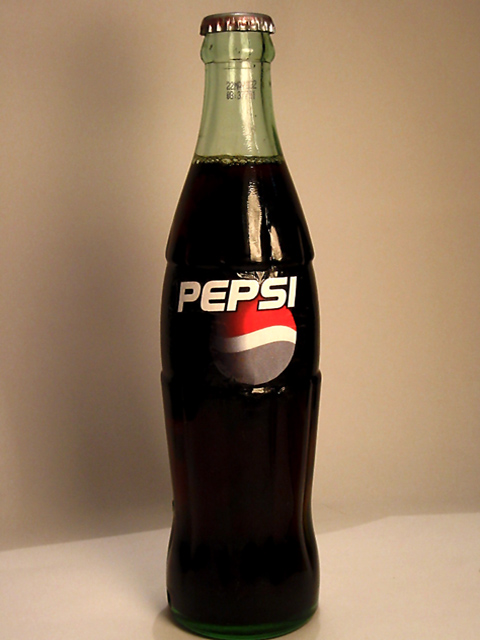
| A fairly nice photo, but I am missing the blueness of it |
|
|
|
12/08/2002 09:02:17 AM |
| Answer: you desaturated the blue. |
|
|
|
12/07/2002 07:13:58 PM |
Nice idea. I'm afraid you might find a more sobering answer to your question at the following link:
//www.pbase.com/image/4093019 |
|
|
|
12/07/2002 09:48:59 AM |
| looks like the blue ink ran out on the bottle printer. way cool shot and blue idea +7 |
|
|
|
12/05/2002 06:51:50 AM |
|
|
|
12/03/2002 08:15:00 PM |
| I don't know what is wrong? lol |
|
|
|
12/03/2002 06:44:00 PM |
| The only thing I see wrong in this pepsi is it looks like a coke bottle, and where's the blue.. And that's all I can find wrong with the photo, too. Your blue on the pepsi emblem is not blue at all. The red is good and red but the blue is stark gray. My moniter? I think not. But it is a clear good photo otherwise. PTL |
|
|
|
12/03/2002 08:39:00 AM |
| Good clean photo, thoght provocking . . . |
|
|
|
12/03/2002 02:09:00 AM |
This photo is the best I've ever seen!
Amazing! |
|
|
|
12/03/2002 01:35:00 AM |
| yeaaa what's wrong wiTh this Pepsi??? Can't you see!!! |
|
|
|
12/02/2002 08:13:00 PM |
| yup, the blue is missing. Maybe a little less cropping on the bottom. Nice details. jacko 6 |
|
|
|
12/02/2002 06:54:00 PM |
| BLUE!! the pepsi colors are blue, red and white, so this is a good idea to make the people think in blue. Yo deserve the 1st. place, good luck. |
|
|
|
12/02/2002 06:39:00 PM |
LOL it's in a Coke bottle! Kool! I wish the blue on the lable was a bit more blue here.
Nice light. Justine |
|
|
|
12/02/2002 05:20:00 PM |
| WHAT IS WRONG WITH THIS PEPSI? |
|
|
|
12/02/2002 04:56:00 PM |
|
|
|
12/02/2002 04:02:00 PM |
| I'm not sure how the Coke/Pepsi amalgam evokes blue, but it is very clever. Photo is underexposed otherwise. |
|
|
|
12/02/2002 03:12:00 PM |
| By St. Beidenhorn! that is a coke bottle |
|
|
|
12/02/2002 02:06:00 PM |
esta muy padre la idea de contraponer a las dos marcas de refrescos de cola ,felicidades ,me encanto
|
|
|
|
12/02/2002 02:04:00 PM |
|
|
|
12/02/2002 10:29:00 AM |
What's wrong with it?! There is almost no blue!!
You should have saved this nice idea for a better fitting challenge. |
|
|
|
12/02/2002 09:29:00 AM |
| This is a decent shot. The framing of it has the bottom of the bottle cut out of the shot and the break of the white behind the bottle also tends to distract the eye from the overall crispness of the picture. |
|
|
|
12/02/2002 08:53:00 AM |
| lack of interest. the title tries desperately to grab your attention but fails miserably because of the photo. eh...i'll give a 4. |
|
|
|
12/02/2002 05:24:00 AM |
I will tell you what is wrong. Your lighting flat out stinks. I do not care if the label is not blue but diffuse that light. It hurts my eyes. Fix your white balance also if you can.
|
|
Home -
Challenges -
Community -
League -
Photos -
Cameras -
Lenses -
Learn -
Help -
Terms of Use -
Privacy -
Top ^
DPChallenge, and website content and design, Copyright © 2001-2025 Challenging Technologies, LLC.
All digital photo copyrights belong to the photographers and may not be used without permission.
Current Server Time: 03/14/2025 03:37:18 PM EDT.