| Author | Thread |
|
|
12/10/2002 01:13:25 AM |
The Critique Club
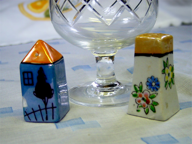
The clarity and focus of your photo are excellent. The exposure is good and there seem to be no faults in the processing of your picture technically this is a good photo apart from a slight tilt in your cropping
The problem with this image is the composition.
There seems to have been no thought given to how the condiment set should be placed�it seems to be a random placing with the glass somehow in the middle. This appears to have been taken at a mealtime on the spur of the moment�but you must think about your composition. There is a place for random photos�normally taken by geniuses with a huge reputation behind them to back up the photo�but we mere mortals have to think carefully about how we place our objects and what we use as background You could have tried several variations on your theme�should the glass be knocked over and wine spilled out�the salt cellar could be half way behind the pepper�should you be closer or further away --there are hundreds of variations that could turn a random picture into a masterpiece using the same elements. Your technical mastery is v. good - now you should practice your compositional skills and you will soon be beating us all! Although looking at your other photos I think you have a lot of talent�perhaps you werejust having an off day!
Andrew
|
|
Comments Made During the Challenge  |
|
|
12/06/2002 02:00:27 PM |
| i\'m not real sure as to what is your subject. From your title it is the blue squares on the table cloth. If that is so. There are not many of them in focus. The table cloth should be smoth. It is raised up behind the white shaker. The background is should be clear or one solid color. According to your pictue the glass and two shakers are the subject. If that is the case the glass should never have cropped, shouldn\'t have anyway. and the same other points as with the table cloth. I think you might have meant the shakers to have been. If that is the case, why put the glass in at all. It just adds clutter to the subject. And they are not in good focus, especially if they are the subject. The other points also are valid here. This might have been a decent but you have very poor execution. PTL 3 |
|
|
|
12/03/2002 11:26:00 PM |
| Pretty colors.. To me, the glass or bowl in the middle takes away from the blue theme. |
|
|
|
12/03/2002 08:53:00 PM |
| nice macro, but it looks tilted. |
|
|
|
12/02/2002 04:31:00 PM |
| Blue is dominant here, but there is no clear theme. Many light colors muddle the photo. Good usage of DOF to isolate shakers and glass. |
|
|
|
12/02/2002 11:15:00 AM |
| Very clear, but the shot seems to lean to the left a bit. Perhaps if the shaker on the right was moved more forward in the frame it would help. This says antiques to me more than blue. = 5 |
|
|
|
12/02/2002 10:30:00 AM |
| I think the composition is what holds this shot back. The portions are not right and the light overhead is a little too strong. I will say it's a clear, crisp, in focus shot. Justine |
|
|
|
12/02/2002 05:19:00 AM |
| Yes they are, but what is so special about htis picture that warrents a persons attention? |
|
Home -
Challenges -
Community -
League -
Photos -
Cameras -
Lenses -
Learn -
Help -
Terms of Use -
Privacy -
Top ^
DPChallenge, and website content and design, Copyright © 2001-2025 Challenging Technologies, LLC.
All digital photo copyrights belong to the photographers and may not be used without permission.
Current Server Time: 03/14/2025 01:03:18 PM EDT.