| Author | Thread |
Comments Made During the Challenge  |
|
|
08/06/2010 11:45:06 PM |
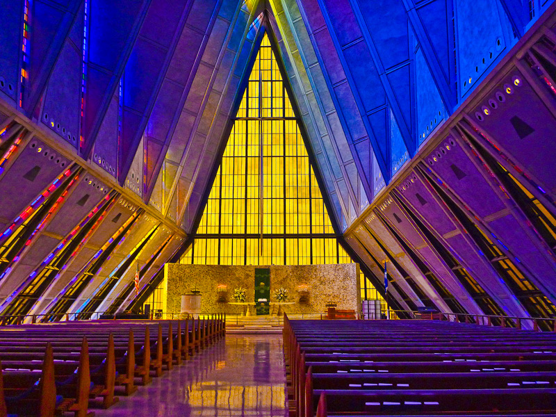
| I just really love the colors! I loved it in the book and its really brilliant on screen! |
|
 Photographer found comment helpful. Photographer found comment helpful. |
|
|
08/06/2010 10:03:51 PM |
| I wonder if the color isn't a bit too much. Very impressive all the same. |
|
| Photographer found comment helpful. |
|
|
08/06/2010 12:55:57 AM |
| Awesome color. I like the photo, but I wish the POV was straight down the aisle, rather then a bit off set. For me, would have been an 8 straight down, 7 as is- it throws the balance off... Nice shot though. |
|
| Photographer found comment helpful. |
|
|
08/04/2010 09:03:29 PM |
|
| Photographer found comment helpful. |
|
|
08/04/2010 06:26:36 AM |
| i do no like modern churches, but i like your shot... |
|
| Photographer found comment helpful. |
|
|
08/04/2010 12:45:25 AM |
| This place almost begs to be shot symmetrically. It feels a bit "off" otherwise I think. |
|
| Photographer found comment helpful. |
|
|
08/01/2010 08:41:47 PM |
| Can't decide if I like the asymmetry here or not. I think it probably adds just enough flavor to it, but I might have to come back to it. Seems a little soft. 6 for now. |
|
| Photographer found comment helpful. |
|
|
08/01/2010 03:12:55 PM |
The colours and shapes here are exceptional. These make this image stand out for people to chose from the thumbs......
I note that that image is close to symmetrical, but isn't. I find this distracting. While the image does not need to necessarily be symmetrical, this is too close though to work. I feel you either needed to be further to the right (and therefore clearly offset) or to the left, and lined the image up to be perfectly mirrored......Either would have worked well, and I feel would have boosted your score.
But still, above all, the colours are what will make this stand out. |
|
| Photographer found comment helpful. |
|
|
08/01/2010 12:43:00 PM |
| Wonderful color and symmetry |
|
| Photographer found comment helpful. |
Home -
Challenges -
Community -
League -
Photos -
Cameras -
Lenses -
Learn -
Help -
Terms of Use -
Privacy -
Top ^
DPChallenge, and website content and design, Copyright © 2001-2025 Challenging Technologies, LLC.
All digital photo copyrights belong to the photographers and may not be used without permission.
Current Server Time: 03/15/2025 03:04:00 AM EDT.