| Author | Thread |
|
|
12/15/2002 07:56:04 PM |
Critique Club
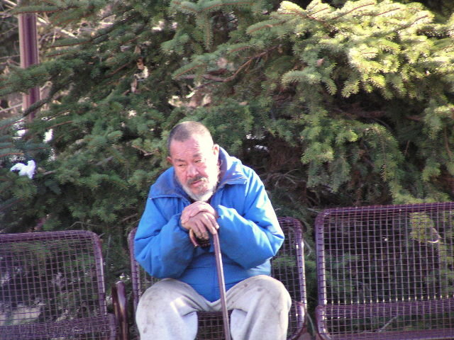
INITIAL RESPONSE: Quick spontaneus shot. Some blue. Technical flaws (composition)
COMPOSITION-CONTENT - The composition is not very good I think. as it is , it does not tell us anything. Too bad because the expression looks promising. If it is your originial idea of composition then it should show the the person in full or you might get closer. the picture is 'tilted' without bringing anything special. (see very good comment of derekleung about the composition of your shot)
BACKGROUND : Would have deserved to be more blurred as its not very interesting to 'detacht' the person more.
CAMERA WORK-TECHNICAL- It's probably a 'passing shot' (pun not intended) but it would have been really better if you could have had time to copose the shot better.
DIGITAL PROCESSING - TECHNICAL - Looks a little noisy and maybe oversharpen a little.
MY OPINION ON THE PHOTO - The person was a good candidate for a nice 'people shot' if you could have take your time. As it is I think it's a little 'missed' even if you had the eye to see the potential of this person.
Lionel
|
|
Comments Made During the Challenge  |
|
|
12/08/2002 11:28:39 PM |
| Unless this man is on a hill, I think if you straightened the picture so that the bench was not slanted it would have a better effect. |
|
|
|
12/08/2002 09:32:39 AM |
| This guy looks kinda blue and out of focus and he appears to be listing to one side. Sidelightin g is very harsh. |
|
|
|
12/08/2002 08:54:12 AM |
|
|
|
12/08/2002 02:18:27 AM |
| very good subject, I think lighting could have been utilized a bit better |
|
|
|
12/07/2002 12:19:42 PM |
| Good idea. Rotate to level and focus on the face. |
|
|
|
12/07/2002 12:02:19 PM |
| The lighting here is quite harsh on the trees in the upper right and on the side of this mans face. the focus is also a bit soft for my tastes. it seems to have a very noticable left tilt. I do like how you have both the feeling blue and the color blue in the shot. Good luck in the challenge. |
|
|
|
12/06/2002 08:14:12 AM |
| Would have been a great shot if placement and focus was better. Nice try. |
|
|
|
12/05/2002 03:14:19 AM |
| This is almost a documentary shot. However, it doesn't document nor tell a story strong enough to let the viewer share this gentleman's "blueness". He doesn't seem to look sad or down. To my eyes, he looks tired. Also, you have included the tree in the background which covers almost 50% of your shot. Several suggestion: 1. A close-up shot on the gentleman's face. The gentleman's looks and expression can tell a thousand stories. 2. If the person is sitting down, include his feet. By the look of his attire, his shoes would also tell a different story. 3. If you follow n° 2, vertical crop the shot and disregard (or blur) the background. Nonetheless, you have a good eye in spotting the moment and your subject, only let down by a few technicalities. 5. |
|
|
|
12/03/2002 06:49:00 PM |
| Good shot except a little too soft on the focus. Love athe old man and his expression. PTL |
|
|
|
12/03/2002 05:59:00 PM |
| I wish the picture was more of a close-up, but the subject definitely gives the impression of sadness, or being 'blue'. |
|
|
|
12/03/2002 09:01:00 AM |
|
|
|
12/03/2002 03:44:00 AM |
| the angle of the picture makes it look like the seats and person are falling off the picture to the left. |
|
|
|
12/02/2002 08:20:00 PM |
| Poor guy. Did you buy him a cup of coffee? |
|
|
|
12/02/2002 05:21:00 PM |
| A close up with more cropping of trees might be more effective. |
|
|
|
12/02/2002 02:32:00 PM |
| I definately see blue in this man but I wonder if you could have shown more of his surrounding to give a better idea of his isolation. (although perhaps that was not possible if there was too much commotion in the surrounding area). The only other suggestion would be to place him a bit more out of the center of the shot so he was more to the left or right. |
|
|
|
12/02/2002 10:21:00 AM |
| This is an interesting shot. I'm sorry it's not level and the it wasn't cropped tighter. Justine |
|
|
|
12/02/2002 08:51:00 AM |
| This would have been better, if the picture was rotated right a bit, and the subject a bit less contrasty (softer lighting). His expression is great. |
|
|
|
12/02/2002 04:32:00 AM |
| I don't see too much "blue" in the mood of the man. Looks more tired than blue. |
|
|
|
12/02/2002 04:30:00 AM |
| I wish this were a little bit more in focus. |
|
|
|
12/02/2002 12:57:00 AM |
| If this picture was in better focus, and level it would have looked a lot better. |
|
Home -
Challenges -
Community -
League -
Photos -
Cameras -
Lenses -
Learn -
Help -
Terms of Use -
Privacy -
Top ^
DPChallenge, and website content and design, Copyright © 2001-2025 Challenging Technologies, LLC.
All digital photo copyrights belong to the photographers and may not be used without permission.
Current Server Time: 03/12/2025 01:57:41 AM EDT.