| Author | Thread |
|
|
07/27/2004 04:26:43 AM |
Greetings from the Critique Club!
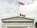
Composition:
This is a pretty standard 'centered' shot. It is kind of interesting, but no "wow" to it. Nothing to keep you looking at it after the first glance. As for this challenge, you probably would've been better off with more of the words visible. Right now they are mostly unreadable.
Lighting:
Lighting is fine. Exposure is correct, possibly a tad on the over-exposed side. (see the white areas on the roof, they look blown out.)
Technical:
Your photo is technically sound. I don't see any errors save possibly the exposure, but that is really minor, and mostly unnoticed.
Post-processing:
It doesn't look like you did any editing at all. Not that this would've helped much, but perhaps it could've made the colors a little bolder.
Overall:
It's not a bad shot. But it's not a great shot either. There's nothing to keep the viewer interested. The best advice I can give, is to try to take photos of things you'd be proud to hang on your wall. This will force you to try to improve and take photos that you like to look at, not just 'meeting the challenge'.
Look forward to future submissions. |
|
 Photographer found comment helpful. Photographer found comment helpful. |
Comments Made During the Challenge  |
|
|
07/18/2004 12:06:27 PM |
|
| Photographer found comment helpful. |
|
|
07/17/2004 03:11:21 AM |
|
| Photographer found comment helpful. |
|
|
07/14/2004 09:00:05 PM |
| good concept/subject- bad compostion/choice of shot |
|
| Photographer found comment helpful. |
Home -
Challenges -
Community -
League -
Photos -
Cameras -
Lenses -
Learn -
Help -
Terms of Use -
Privacy -
Top ^
DPChallenge, and website content and design, Copyright © 2001-2025 Challenging Technologies, LLC.
All digital photo copyrights belong to the photographers and may not be used without permission.
Current Server Time: 03/13/2025 01:21:13 AM EDT.