| Author | Thread |
Comments Made During the Challenge  |
|
|
07/19/2004 02:45:31 AM |
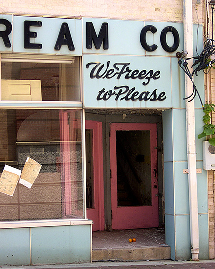
| Nice concept and I like doors/facades but this one has an odd feeling to it. It's definitely not level despite the sidewalk not being level itself. I would have used the edge where the brick meets the blue part of the facade and made that vertical or made sure the doorway/entrance was horizontal. Also appears a bit overexposed. |
|
|
|
07/16/2004 01:34:47 AM |
| Probably needs a tighter crop, it's a little too busy as it is. |
|
|
|
07/14/2004 09:14:25 PM |
| i don't like how the large words got cut off, but besides that nice job |
|
|
|
07/14/2004 04:59:24 PM |
Was cropping off the C in Icecream intentional or just random, I wonder? I got a laugh out of reading "Ream Co." but since the title was "We freeze to please" I don't think the humor was intentional. But then there are those two tiny oranges, or tomatos or whatever, so I'm confused again.
I guess the intent just isn't clear enough for me to evaluate. Graphically, it has some good qualities. I like the pastel colors of the building and door. |
|
|
|
07/14/2004 01:37:53 PM |
| The light in this image seems a bit flat. Perhaps shot with more sidelighting, and a polarizer (to remove the reflection from the glass on left) would add more impact to this (in my humble opinion). Just a side note - having the title replicate the focus of the image does nothing - give it some flair or describe it - don't just repeat it (again - just my opinion). |
|
|
|
07/14/2004 12:23:00 PM |
| Interesting sign, but I think you need some sort of context or visual point to really make this creative--like a guy standing next to it wearing a hat, gloves, and a winter coat, for example. |
|
|
|
07/14/2004 11:16:01 AM |
| Not bad! I'd work on centering to get rid of the brick on the right, and maybe tilt it counterclockwise a few degrees. |
|
Home -
Challenges -
Community -
League -
Photos -
Cameras -
Lenses -
Learn -
Help -
Terms of Use -
Privacy -
Top ^
DPChallenge, and website content and design, Copyright © 2001-2025 Challenging Technologies, LLC.
All digital photo copyrights belong to the photographers and may not be used without permission.
Current Server Time: 03/12/2025 08:07:16 PM EDT.