| Author | Thread |
|
|
09/25/2007 02:19:19 PM |
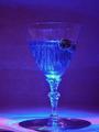
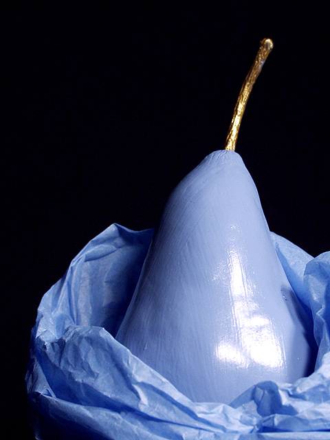
OOOOH that is pretty
I would have probably had more fun painting it than taking the picture tho`. Me loves paint, when its just something I can do for fun and when I`m not being forced to (like in school in Art class). |
|
Comments Made During the Challenge  |
|
|
12/08/2002 10:42:08 PM |
| interesting composition. good match of colors. 8 |
|
|
|
12/06/2002 11:46:11 PM |
| This looks painted rather than colorized. Is it? Good photo, cropped a little off to the right side. Should not have cut the paper off on one side. Nice soft focus. Nice job. PTL7 |
|
|
|
12/05/2002 09:37:34 AM |
|
|
|
11/30/2002 07:54:38 PM |
| I like it. The pale blues go well with the black background, but I think it would be better if you had dipped the pear in paint, rather than painting it, so we couldn't see the stroke marks. Just my opinion. 8 |
|
|
|
12/03/2002 03:41:00 AM |
| well done comp. and lighting. just a little weird color on the fruit. |
|
|
|
12/02/2002 07:12:00 PM |
| Very interesting, and very imaginative. Too bad about that hot spot, I like how you have it off center, and the dark background contrasts nicely. Good luck. |
|
|
|
12/02/2002 04:39:00 PM |
| Nice composition. Good coloration. Sharp. |
|
|
|
12/02/2002 08:25:00 AM |
|
|
|
12/02/2002 04:59:00 AM |
| Would have preferred not to see brush strokes on the pear. |
|
|
|
12/02/2002 02:08:00 AM |
try to find a way to get rid of the light flare on the pear...
~anachronite |
|
Home -
Challenges -
Community -
League -
Photos -
Cameras -
Lenses -
Learn -
Help -
Terms of Use -
Privacy -
Top ^
DPChallenge, and website content and design, Copyright © 2001-2025 Challenging Technologies, LLC.
All digital photo copyrights belong to the photographers and may not be used without permission.
Current Server Time: 03/12/2025 10:05:08 AM EDT.