| Author | Thread |
|
|
04/30/2009 09:51:05 PM |
|
|
|
12/11/2002 07:37:28 PM |
Critique by Natasha for the Critique Club
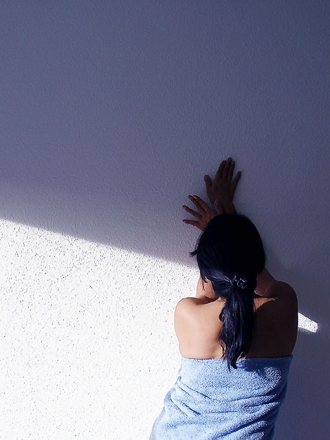
I am finding this one quite hard to critique, I gave it a 7 t the time of voting, but I was expecting it to do better than it did. I think that it deserved to be in the top ten. You have created a very artistic picture here, the composition IS the picture. I like the position that she is standing in and the use of the shadow was fantastic. As I said in my comment, I thought that the empty space at the top was a bit big and I think cropping off a third of this would be good. At the moment the amout of space seems to overpower her, if that's the effect you wanted, then it worked.
The contrast of the shadows is nearly too much, especially around the left side of the towl and a little dark on the upper hand. At the same time, the contrast at this level adds the impact off the picture. I think that if you tried this again, it would be interesting to see the shadows intersecting in the middle of her hands.
Overall, I think that this was a really strong and unique picture, it's very artistic composition. When I saw it during the voting, for some reason the towel bothered me but now that I have looked more carefully, its not an issue! It would actually make an excellent framed picture! I hope that this helps you! |
|
|
|
12/09/2002 11:32:15 AM |
| Aaack - This was a 10 for sure!!!!! What happened? |
|
Comments Made During the Challenge  |
|
|
12/08/2002 09:13:33 PM |
| Great composition. One of my favourites this week. Good job. -arnit |
|
|
|
12/08/2002 01:41:19 PM |
| You have those horrible stucco walls like we have here. Definately blue. I think that the light gets a bit harsh on the wall as it nears the womans body, and on the left side of her towel. I like the half shadow/half light feel. I think it adds to the "longing" or sadness that could be feeling from longing. Focus and clarity are nice, angle and framing/cropping are good as well. Good luck in the challenge. |
|
|
|
12/08/2002 03:53:05 AM |
| i like the photo, but probably would have liked it more if the surface was smoother and the swtich from differing light colours was more straight, maybe thats just me tho ;) |
|
|
|
12/06/2002 06:39:25 AM |
| very stylised-anz-nice work |
|
|
|
12/06/2002 02:02:18 AM |
|
|
|
12/05/2002 04:45:37 PM |
| neat awy she is curving her body and the diagonal shadow. I love the lines of this photo. Very nice! |
|
|
|
12/03/2002 11:31:00 PM |
| This is a beautiful shot. Creative and original. The title just doesn't suit it, IMO. But, of course, I'm not scoring on the title! |
|
|
|
12/03/2002 09:05:00 PM |
| well done! seems to be a lot going on for a simple picture. i like that. good angles, comp, and exposure. 10 goodtempo |
|
|
|
12/02/2002 11:32:00 PM |
| For some reason the photo looks half underexposed and half overexposed... weird. |
|
|
|
12/02/2002 09:40:00 PM |
| I love the composition, contrast etc. It doesnt seem to make sense that she is standing in that position in a towel, but taken in an arty way, this really works! I think a bit cropped off the top would have been good. Good Luck |
|
|
|
12/02/2002 08:04:00 PM |
| Placement of the object and the use of negative space make this an interesting picture. I like the way the blue shadow connects to the blue towel. Lnede |
|
|
|
12/02/2002 01:22:00 PM |
| Nice composition. Not so sure about the shadow. Seems to be improperly placed accross her head. I would have seen it more around her hands. 6 |
|
|
|
12/02/2002 10:26:00 AM |
Wooooohie. The use of shadows and light here is very interesting. I'd of changed the crop on the right....either including more of it or removing it totally. Still it's neat.
Maybe if she would of loosened the towel, so that it drapped more>...?<Good compostition.Justine |
|
|
|
12/02/2002 07:52:00 AM |
|
|
|
12/02/2002 05:11:00 AM |
Longing for what and what does the title have to do with Blue
|
|
|
|
12/02/2002 12:21:00 AM |
| I like the use of the shadow, and the blue towel adds to the "blue" feeling of the picture, the title works great. |
|
Home -
Challenges -
Community -
League -
Photos -
Cameras -
Lenses -
Learn -
Help -
Terms of Use -
Privacy -
Top ^
DPChallenge, and website content and design, Copyright © 2001-2025 Challenging Technologies, LLC.
All digital photo copyrights belong to the photographers and may not be used without permission.
Current Server Time: 03/12/2025 04:05:54 PM EDT.