| Author | Thread |
|
|
07/29/2004 05:03:09 AM |
Hello Timothy from the Critique Club
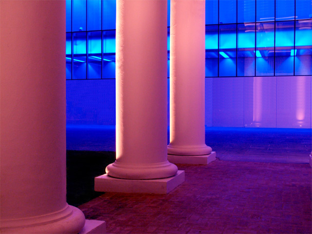
I really love these warm colours so straight away your image is attractive to me. The tones are lovely
The detail and focus are also very good
I see where you are going with this but the image itself does not say Balance to me and I think when you look at the top 10 you will see how people seem to vote
If it is not obvious to a person on a quick glance people tend to vote mid to low if they don't understand the image
So even though your image is very good and a lot of images are in so many of the challenges that do an average or below vote, its just not obvious that this was Balance without the title I doubt people would see that
It is very hard to know what people will like I get frustrated myself
But keep up the good work you have obvious talent and remember to be true to yourself I hope this helps
Good luck in your future challenges
Regards
Sally
|
|
 Photographer found comment helpful. Photographer found comment helpful. |
Comments Made During the Challenge  |
|
|
07/21/2004 10:26:55 PM |
| I can see where you are coming from with the color balance but the image on a whole does not depict balance enough without the title. |
|
| Photographer found comment helpful. |
|
|
07/19/2004 11:10:49 PM |
| Great idea ond execution for this challenge. The title, subject, colors, and even shapes are obvious contrasts that imply the theme of balance. Nice color saturation and focus too. |
|
| Photographer found comment helpful. |
Home -
Challenges -
Community -
League -
Photos -
Cameras -
Lenses -
Learn -
Help -
Terms of Use -
Privacy -
Top ^
DPChallenge, and website content and design, Copyright © 2001-2025 Challenging Technologies, LLC.
All digital photo copyrights belong to the photographers and may not be used without permission.
Current Server Time: 03/12/2025 06:32:40 PM EDT.