| Author | Thread |
|
|
12/21/2002 10:38:48 PM |
Hello Ken, your photo was assigned to me in context of the Critique Club. So here we go:
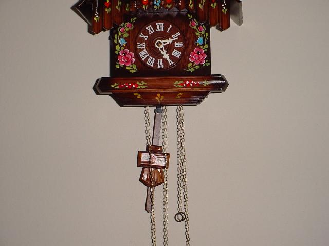
Composition: Very strange cropping ;-) You cut the upper and the lower part of the clock which doesn't look good. Unfortunately I can only guess what you wanted to achieve because you didn't enter any details. Probably you wanted to concentrate on the pendulum. If so then I think you should have zoomed in much more. There is a lot of empty space which does not add something to the photo. But I agree with the people from previous comments that a portrait format would look better here.
Also try a different angle. I think a photo from the side would have been much more interesting.
Lighting/Colours: I personally don't like the lighting. Using the camera built-in flash directly at the subject makes the photo look a quite dull. Also, because of the straight on angle you used you don't see much shadows. This makes the photo look very flat and removes and depth from it.
Switch off the (probably automatically used) flash and use lighting from the side. Maybe a lamp you place there. You proobably will have to use a tripod then because you'll need a longer exposure time.
Focus: Most people used a motion blur effect to actually show the motion. A longer exposure time would have helped with that, too.
Art: Well, I think one reason why the photo scored so low is that it doesn't convey motion very good. In my opinion a motion blur on the pendulum would have looked good here. Maybe you'll try to reshoot the photo?
Stephan |
|
|
|
12/18/2002 08:43:53 PM |
Greetings from the critique club!
Because the pendulem is not straight down, this shows motion, and so it definetly meets the challenge. The subject is a nice object too, and it would have been fine to show more of it.
The lighting is bright enough, and the focus is clear. As you have already heard by now, it would have been much better to show the whole clock.
Grayce aka Gracious |
|
Comments Made During the Challenge  |
|
|
12/15/2002 09:33:07 PM |
| I don't understand the framing of this shot. The clock is centered horizontally yet fills only the middle third of the frame. Vertically the top of the clock is cut off. Taking this shot with a portrait orientation might have been a good idea, or else an off center subject placement might have helped. This shot still needs something else to give it some oomf though, as it currently comes off as a rather dull shot. A unique angle, framing, or close up could all help create a less generic appearance. 2 |
|
|
|
12/15/2002 06:44:27 PM |
| I think this would look better with softer lighting and letting the pendulum blur. |
|
|
|
12/15/2002 04:19:29 PM |
| Would have been better with stillness and motion as contrast. |
|
|
|
12/12/2002 09:58:12 PM |
| I\'d like this so much better if you\'d shown the entire clock. I don\'t really understand why you chose to crop where you did. 5 |
|
|
|
12/12/2002 02:17:06 AM |
Does the Photo fit the Challenge (5)
Colors(6)
Composition(4) Cut half clock out. :-(
Focus(6)
Background(4)
Lighting (4) slightly harsh.
Title(4)
Overall Score (4.71) rounded to 5 |
|
|
|
12/11/2002 07:13:46 AM |
| While this photo does convey movement to me, it is quite static. I believe that is from the "straight on" composition and how the subject is centered. Did you try this in a verticle crop as well? That might have worked better for me. |
|
|
|
12/10/2002 02:26:42 PM |
| This would be better as a long exposure/slow shutter - maybe with the pendulum going all the way if your camera can do it. |
|
|
|
12/09/2002 03:10:40 PM |
| You could have turned the camera round to fit it all in. |
|
|
|
12/09/2002 09:00:06 AM |
|
|
|
12/09/2002 07:05:37 AM |
| I would have used a long-ways shot here, to show more of the chain and not cut off the top. Also, this would fill the picture more and leave out more of the blank wall. |
|
Home -
Challenges -
Community -
League -
Photos -
Cameras -
Lenses -
Learn -
Help -
Terms of Use -
Privacy -
Top ^
DPChallenge, and website content and design, Copyright © 2001-2025 Challenging Technologies, LLC.
All digital photo copyrights belong to the photographers and may not be used without permission.
Current Server Time: 03/16/2025 02:38:50 PM EDT.