| Author | Thread |
|
|
04/06/2011 04:36:13 PM |
Greetings from the Critique Club! You asked for an in-depth critique of your image and here it is:
Congratulations on placing top 20 in a very open-ended challenge. Your image is well executed as also reflected by your decent score.
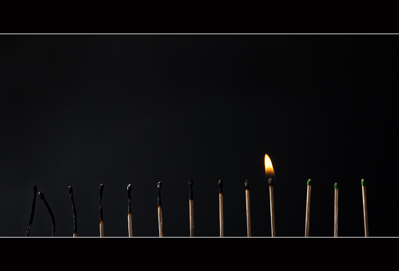
The concept is good - not only 13 matches and one burning, but there is a progression in the burned matches, which creates some visual interest. The light source seems to be coming from the left, and as such illuminates the first half of the matches pretty well. Further to the right, though, the lighting is a little challenged, and I find myself squinting to make out more detail in that part of the image. The lighting or lack thereof is also what makes the right part somewhat flat. That would be my only technical critique for this photo.
Conceptionally it's cute, no real content. Here on this site that is rewarded nonetheless. The border really brings this photo together - good choice in using it as you did.
Best wishes,
Alicia |
|
Comments Made During the Challenge  |
|
|
04/03/2011 10:43:12 AM |
I am participating in the "Why a '5' not a '6'?" commenting activity (see recent forum thread). Viewers are asked to leave a comment with some of their votes of '5' letting the photographer know why, for them, it fell short of a vote of '6'. If you have found this comment useful, you may wish to offer some of your own to those images where you vote 5.
This photo is clearly well executed and does a good job at meeting the challenge. However, I think it does lack depth and the intrinsic interest level of matches isn't that high. I do like the way you've used the border as a shelf though.
Overall, there's certainly nothing wrong with this image, I think you've made a fine job of it; it's just that the final result doesn't leave me with anything.
It has to be said though, this isn't the most inspiring challenge. In fact my average score given in this challenge is much less than 5. |
|
 Photographer found comment helpful. Photographer found comment helpful. |
|
|
03/30/2011 10:52:14 AM |
| nicely photographed - the placement of the flame, the progression of those that burned out, the apparent randomness of the heights all work well. And I think the border here, especially the white lines, really add to the image. Very nice work. |
|
| Photographer found comment helpful. |
|
|
03/29/2011 09:30:01 AM |
|
|
|
03/28/2011 12:18:04 AM |
| I would say this is in the running to win a ribbon. |
|
Home -
Challenges -
Community -
League -
Photos -
Cameras -
Lenses -
Learn -
Help -
Terms of Use -
Privacy -
Top ^
DPChallenge, and website content and design, Copyright © 2001-2025 Challenging Technologies, LLC.
All digital photo copyrights belong to the photographers and may not be used without permission.
Current Server Time: 03/12/2025 05:26:00 PM EDT.