| Author | Thread |
|
|
04/18/2011 01:32:03 PM |
Originally posted by Adz:
Wow that is devotion! Don't let the score put you off entering because you must have some fantastic ideas! |
Thank you! I know I need to learn a lot about lighting.. so I will keep on trying :) |
|
|
|
04/17/2011 06:10:28 PM |
| Wow that is devotion! Don't let the score put you off entering because you must have some fantastic ideas! |
|
 Photographer found comment helpful. Photographer found comment helpful. |
|
|
04/16/2011 12:35:36 PM |
Originally posted by Glacian22:
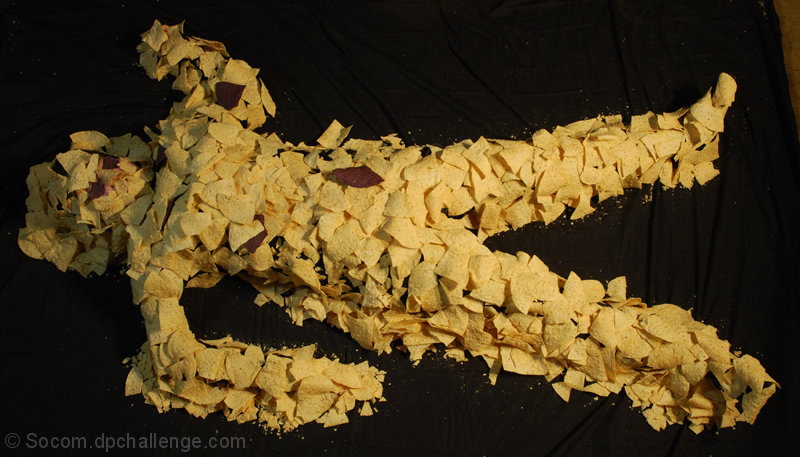
Well, with the lighting the way it is, you ended up with some really heavy shadows on her head, while her feet are comparatively very bright. Though shadows are definitely nice sometimes, I probably would have used another light source to help illuminate her upper half, so the viewer's focus isn't immediately drawn towards her lower body. |
Ahh that does make sense! I did have one strong light pointed at her feet towards her head, but light dropoff killed it. I had a couple smaller lights near her head, but they just were not strong enough. I really need to invest in some lighting and flashes, so used to out door shots where I dont worry about that. Thanks for the reply! |
|
|
|
04/16/2011 04:10:00 AM |
Originally posted by Socom:
What do you mean by broaden the lighting? I do mostly outdoor natural shots, so DPC is helping me learn these types of things. So anything you can clarify would be greatly appreciated! :) |
Well, with the lighting the way it is, you ended up with some really heavy shadows on her head, while her feet are comparatively very bright. Though shadows are definitely nice sometimes, I probably would have used another light source to help illuminate her upper half, so the viewer's focus isn't immediately drawn towards her lower body.
This is me being a little hypocritical here, as I hate futzing with lots of lights. ^_^ |
|
| Photographer found comment helpful. |
|
|
04/15/2011 03:06:37 AM |
Originally posted by Neat:
What can't believe this did'nt ribbon. |
Thank you!, to many technical mistakes, the sheet showing its a sheet and not just blackness and the top right corner not being cropped. Was a lot of fun taking it tho :) Well for me more so then for my daughter lol
Message edited by author 2011-04-15 03:11:04. |
|
|
|
04/15/2011 12:28:51 AM |
| What can't believe this did'nt ribbon. |
|
| Photographer found comment helpful. |
|
|
04/13/2011 10:50:16 PM |
Originally posted by Glacian22:
While I appreciate all the effort that must have gone in to making this shot, the problem is that it's still flawed in execution. I'd probably have broadened the lighting, and gone for a tighter shot. Still, what a great idea! :) |
What do you mean by broaden the lighting? I do mostly outdoor natural shots, so DPC is helping me learn these types of things. So anything you can clarify would be greatly appreciated! :) |
|
|
|
04/13/2011 10:49:03 PM |
Originally posted by SEG:
Looks like a lot of work went into the execution but not the follow through. It's too obvious that the person is laying on a sheet and the upper right corner just kills it. Needed to crop that out!! |
I agree, it was my first shot with DPC and I dont think I completely understand the editing rules even tho I have read them a few times. I could have done some contrast and brightness and you wouldnt have seen the sheet at all, but from how I read it, I assumed those changes were not allows. Same with the crop, I really couldnt get that top right out without chopping off her foot. My fault for not taking the shot better so I wouldnt have to worry about it! :) |
|
|
|
04/13/2011 10:46:50 PM |
Originally posted by tanguera:
Hahaha! Very clever. That one dark chip is disconcerting though. Is it meant to be a wound of some sort? Not sure it works... |
The dark chips were.. well im not sure, we put a few in, small ones over her eyes and mouth, then I couple on the main body, maybe I should have named this... Death of the Chip Monster! :) |
|
|
|
04/13/2011 12:10:46 AM |
Thank you for all the comments, I know that top right was pretty bad, I couldnt frame it any better as my daughter was freaking out from being still for so long. From what I read about the cropping rules there was really no real way for me to just crop it out, so I left it. I had fun with this and hope to do more :) so thank you all again!
Message edited by author 2011-04-13 00:19:22. |
|
Comments Made During the Challenge  |
|
|
04/12/2011 01:27:58 PM |
| This reminds me of the movie poster for Office Space, but it also makes me think of the movie Swamp Thing. I can't stop wondering if something just happened to the monster, or if it is about to get up from a rest, or from being born. I think more dramatic lighting or something to help make the atmosphere more eerie would be great. Awesome idea and effort! |
|
| Photographer found comment helpful. |
|
|
04/12/2011 12:27:02 PM |
| Hahaha! Very clever. That one dark chip is disconcerting though. Is it meant to be a wound of some sort? Not sure it works... |
|
| Photographer found comment helpful. |
|
|
04/11/2011 01:45:48 PM |
| Really creative, probably would have rotated to make it look like he was standing though. It would work better with your title. |
|
| Photographer found comment helpful. |
|
|
04/10/2011 10:36:46 PM |
| LOL. Is that a real person, 10 for effort. |
|
| Photographer found comment helpful. |
|
|
04/08/2011 11:40:25 PM |
| Looks like a lot of work went into the execution but not the follow through. It's too obvious that the person is laying on a sheet and the upper right corner just kills it. Needed to crop that out!! |
|
| Photographer found comment helpful. |
|
|
04/08/2011 05:13:57 AM |
| While I appreciate all the effort that must have gone in to making this shot, the problem is that it's still flawed in execution. I'd probably have broadened the lighting, and gone for a tighter shot. Still, what a great idea! :) |
|
| Photographer found comment helpful. |
|
|
04/06/2011 06:40:09 PM |
| wow, did you really, I guess you did. I just wish the lighting was better |
|
| Photographer found comment helpful. |
|
|
04/06/2011 12:18:51 PM |
| lol! What a great idea. Nice work. |
|
| Photographer found comment helpful. |
|
|
04/06/2011 12:13:13 PM |
|
| Photographer found comment helpful. |
|
|
04/06/2011 08:01:45 AM |
|
| Photographer found comment helpful. |
Home -
Challenges -
Community -
League -
Photos -
Cameras -
Lenses -
Learn -
Help -
Terms of Use -
Privacy -
Top ^
DPChallenge, and website content and design, Copyright © 2001-2025 Challenging Technologies, LLC.
All digital photo copyrights belong to the photographers and may not be used without permission.
Current Server Time: 04/25/2025 06:21:10 PM EDT.