| Author | Thread |
Comments Made During the Challenge  |
|
|
08/08/2004 08:37:56 PM |
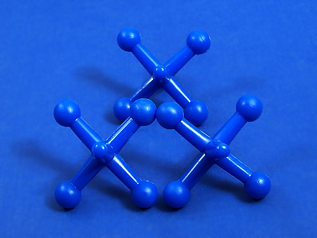
| Yes you met the challenge, and the composition is creative. That said, the blue appears to be too saturated to me, and my eye is distracted by the blown highlights on the legs of the jacks. Practice with other lighting positions to see what happens, and maybe even moving the jacks to a non-symmetrical position would create some more interest as well. |
|
 Photographer found comment helpful. Photographer found comment helpful. |
|
|
08/08/2004 08:28:55 PM |
|
| Photographer found comment helpful. |
|
|
08/06/2004 12:33:46 PM |
|
| Photographer found comment helpful. |
|
|
08/06/2004 12:12:36 PM |
| I like your subject. I wish there were greater contrast between the subject and the background either by use of color or by lighting. |
|
| Photographer found comment helpful. |
|
|
08/05/2004 04:25:36 AM |
|
| Photographer found comment helpful. |
|
|
08/03/2004 05:43:35 PM |
Cool image. Good composition, though these symmetrical shots are e x t r e m e l y hard to get perfect. For instance, the two jacks next to each other are at slightly different vertical levels near the top points that are touching and the left jack covers up more of the far jack than the right jack does.
Good lighting, makes nice shadows. |
|
| Photographer found comment helpful. |
|
|
08/02/2004 08:29:11 PM |
| Not three dimensional. I don't know if it is the angle or the glare. |
|
Home -
Challenges -
Community -
League -
Photos -
Cameras -
Lenses -
Learn -
Help -
Terms of Use -
Privacy -
Top ^
DPChallenge, and website content and design, Copyright © 2001-2025 Challenging Technologies, LLC.
All digital photo copyrights belong to the photographers and may not be used without permission.
Current Server Time: 04/19/2025 06:32:50 AM EDT.