| Author | Thread |
|
|
10/10/2011 09:57:13 AM |
|
 Photographer found comment helpful. Photographer found comment helpful. |
|
|
06/10/2011 07:52:40 AM |
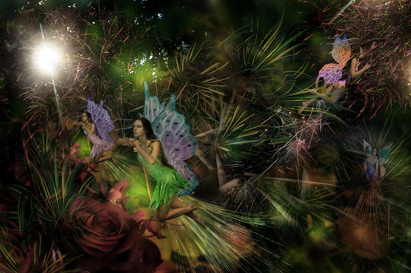
Very pretty Judi - the surreal feel of this works well.
I just wonder if a slightly different pose on Kita in the background image would have worked better to give this a more completed look. The one of her dead center and then the one to the left appear very similar (if not the same) |
|
| Photographer found comment helpful. |
|
|
06/10/2011 05:46:52 AM |
| Way to go, Judi!! Congrats on the top 10 :) |
|
| Photographer found comment helpful. |
|
|
06/10/2011 12:26:17 AM |
| Congrats on the top 10, Judi!! |
|
| Photographer found comment helpful. |
|
|
06/10/2011 12:21:20 AM |
| ANOTHER Top Ten! Congratulations. |
|
| Photographer found comment helpful. |
|
|
06/10/2011 12:06:04 AM |
| This is wonderful cobber. |
|
| Photographer found comment helpful. |
Comments Made During the Challenge  |
|
|
06/09/2011 10:34:30 PM |
|
| Photographer found comment helpful. |
|
|
06/05/2011 04:45:45 PM |
| I like this a lot. It's very original. I wish the colors were brighter though. Also, I'm not crazy about the bright white spot. |
|
| Photographer found comment helpful. |
|
|
06/05/2011 10:35:38 AM |
| Beautiful! good art skill but i think it will be much better without that smaller fairy of same posture. |
|
| Photographer found comment helpful. |
|
|
06/04/2011 10:40:55 PM |
| Very pretty! Love it! The colors are beautifully soft and muted! They look so busy! :) Wonder what they are up to? |
|
| Photographer found comment helpful. |
|
|
06/04/2011 05:07:09 PM |
| I started to give you an 8 and came back to up it to a 9 because it stuck with me and it must have been a huge effort! |
|
| Photographer found comment helpful. |
|
|
06/04/2011 01:04:29 PM |
| So much good technical work here but the image is an illustration that I do not find particularly novel. |
|
| Photographer found comment helpful. |
|
|
06/03/2011 10:52:02 PM |
| Very cool! One of my highest scores for this challenge. |
|
| Photographer found comment helpful. |
|
|
06/03/2011 12:26:18 PM |
| I like the idea, and it's nicely done. I wish you hadn't put the two fairies so close in the lower left, simply because they're too similar. It looks more like a cut and paste instead of two different fairies. If they had been separated a bit more, or flipped or something, I think it would have worked better. |
|
| Photographer found comment helpful. |
|
|
06/03/2011 11:55:22 AM |
| Nice colors and concept. I wish the two fairies on the left had slightly different positions since they just look like clones of each other. The fairy on the far right is practically invisible. |
|
| Photographer found comment helpful. |
Home -
Challenges -
Community -
League -
Photos -
Cameras -
Lenses -
Learn -
Help -
Terms of Use -
Privacy -
Top ^
DPChallenge, and website content and design, Copyright © 2001-2025 Challenging Technologies, LLC.
All digital photo copyrights belong to the photographers and may not be used without permission.
Current Server Time: 04/25/2025 04:48:13 PM EDT.