| Author | Thread |
|
|
01/03/2003 08:32:41 AM |
| The Critique Club for Greenhousejumble Was not very good reading. I dont think i ever read a quality Critique from the club yet |
|
|
|
12/21/2002 09:19:53 AM |
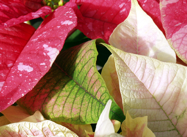
Critique Club for Greenhousejumble
Composition - This array of leaves leaves me looking for a real focal point. I think one of the red plants with the white spots would've been an effective focal point, placed where the green leaf is. The general arrangement is good, not too much open space between stuff. I don't like the shadow on the bottom right. The white leaf at the top right has a little burned out spot, but nothing major.
Background - N/A
Camera work - This picture might be better with just a hint less exposure. I also might have tried to make the crop not quite so tight. Other than that, it looks good to me.
Post-processing - I think the colored leaves could use a little more saturation to make the colors stand out better. As is though, there isn't anything wrong with it.
Overall - This is a nice picture. It doesn't have that WOW factor to it. Boosting the colors would help that a little, but I think finding that one unique plant amidst all the more "normal" looking plants would add to the visual appeal. The concept has potential but the composition would have to change some to give it some focal point for the viewers. - Inspzil
|
|
Comments Made During the Challenge  |
|
|
12/15/2002 10:31:06 AM |
| Nice picture of your leaves, good focus, DOF and exposure. It doesn't particulary WOW me but it might look good, great big on an office wall . |
|
|
|
12/14/2002 09:35:02 AM |
| Good focus. The colors seem a little washed out to me. It is a jumble, but it works. |
|
|
|
12/12/2002 05:48:02 PM |
| Pretty, colorful and matches the title well. Nice display. Additional lighting might have made some of the extra shadow disappear. 8 Swash |
|
|
|
12/12/2002 10:41:52 AM |
| Good choice of colors. Light source is a little sharp. Did you mean to have the DOF not encompass the most forward leaves? |
|
|
|
12/12/2002 10:33:28 AM |
| Beautiful! The colours and the patterning on the leaves are amazing! The light is soft enough to bring out every tiny detail. The leaves have a kind of spongy feel to them, very tactile. The way the composition centres around that green leaf works really well. I'm giving it 10. |
|
|
|
12/12/2002 08:27:54 AM |
| Wonderful texture and color. |
|
|
|
12/11/2002 03:08:26 PM |
| Gah it looks like my original comment on this photo has disappeared, so I'll try again - the composition and colours of this shot are good, creating plenty of interest within the shot. However, the lighting is too bright (some of the white leaves are almost blown out), and there isn't enough contrast to bring out the surface details of most of the leaves, which is a shame. If this image doesn't seem too bright, it may be due to your monitor calibration - please PM me if you want me to explain this further. |
|
|
|
12/11/2002 11:54:38 AM |
| Nice detail here but some of the lighting seems a bit too harsh - especially on the leaf on the right and on the bottom. You might not have had much control over that though. I like the mix of colors. = 6 |
|
|
|
12/10/2002 10:24:09 PM |
| I like the composition. I think that with a little sharpening and color adjustments this would make a real nice photo. I like the green leaf being the center of attention. |
|
|
|
12/10/2002 09:51:39 PM |
| Nice picture, well cropped. I find the braek in the lealfs, on the upper left side of the image, a bit distracting. Also, personally, I would saturate the colours a bit more. |
|
|
|
12/09/2002 10:23:06 PM |
| I love the colors in this picture they work wonderfully. The shadows are nice. the focus looks good. Overall looks like a great shot to me. Well done. |
|
|
|
12/09/2002 09:50:17 PM |
| a lot of color but the composition is named pretty well, the picture is a bit too jumbled. |
|
|
|
12/09/2002 09:27:31 PM |
| Very seasonal, may be just a bit too jumbled. |
|
|
|
12/09/2002 01:05:57 AM |
| What lovely color. The lighting is just right on this to bring out a lot of color. ALMOST a bit bright on the whites, however not bad at all. I really like how you have filled the entire photo with the subject. Great angle and framing/cropping. focus is also well done. Great shot. Good luck in the challenge. |
|
Home -
Challenges -
Community -
League -
Photos -
Cameras -
Lenses -
Learn -
Help -
Terms of Use -
Privacy -
Top ^
DPChallenge, and website content and design, Copyright © 2001-2025 Challenging Technologies, LLC.
All digital photo copyrights belong to the photographers and may not be used without permission.
Current Server Time: 03/14/2025 09:24:18 AM EDT.