| Author | Thread |
|
|
12/29/2011 11:35:44 PM |
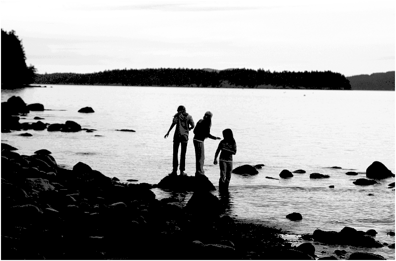
| They certainly appear to be enjoying themselves. I like the rich contrast. |
|
 Photographer found comment helpful. Photographer found comment helpful. |
|
|
11/02/2011 02:41:08 AM |
| The image would definitely lose feeling if it were more defined or sharper. Black areas do not contain extra info needed, the treeline and shoreline is there, and the rocky area has all the definition needed to know what is there, but not to distract. In other words, perfect. The fillies need to be in the middle, because that is the idea, 3 young ones in the world. Again, perfect. Thanks. |
|
| Photographer found comment helpful. |
|
|
11/02/2011 01:54:17 AM |
| The composition of the hands portray all the beauty of youth in silhouette. The landscape beautifully frames these lovely young ladies. |
|
| Photographer found comment helpful. |
|
|
11/02/2011 12:41:37 AM |
| am on bad small monitor at moment- but it looks great - fantastic silhouettes and vasty vasty echoes beyond. |
|
| Photographer found comment helpful. |
Comments Made During the Challenge  |
|
|
11/01/2011 11:25:30 PM |
| for me the contrast is very off on this...to much pixelation going on all over the picture...rocks, girls, treeline... |
|
| Photographer found comment helpful. |
|
|
11/01/2011 08:53:08 PM |
| I like the pose of the three girl. It almost look like a multiple exposure of a single girl turning and then walking off the rock. I wonder if it might have worked better underexposing to retain more detail in the sky while making the three girls into silhouettes. |
|
| Photographer found comment helpful. |
|
|
11/01/2011 05:30:46 PM |
| Crop most of the sky off, it detracts from the girls. |
|
| Photographer found comment helpful. |
|
|
10/29/2011 09:12:29 PM |
| shadows detract from the photo |
|
|
|
10/27/2011 10:36:52 AM |
| Gorgeous scene, the high contrast works well. |
|
| Photographer found comment helpful. |
|
|
10/26/2011 08:42:58 PM |
| The contrast is a bit too dark for my liking as too much detail is lost from the beach and the girls. Pretty cool overall though. |
|
| Photographer found comment helpful. |
|
|
10/26/2011 06:32:28 PM |
| I do like this but i'm thinking it would have been better if the children were to one side rather than centered.. would make for a better composition i feel. |
|
| Photographer found comment helpful. |
|
|
10/26/2011 05:43:05 AM |
| My monitor is dark, but I think you're missing a lot of mid-range i.e. highlights are blown out and shadows are too dark. Given it's advanced editting, you could have arguably done something about this. |
|
| Photographer found comment helpful. |
|
|
10/26/2011 01:07:01 AM |
| too dark for me, lots of image noise. |
|
| Photographer found comment helpful. |
Home -
Challenges -
Community -
League -
Photos -
Cameras -
Lenses -
Learn -
Help -
Terms of Use -
Privacy -
Top ^
DPChallenge, and website content and design, Copyright © 2001-2025 Challenging Technologies, LLC.
All digital photo copyrights belong to the photographers and may not be used without permission.
Current Server Time: 04/25/2025 04:58:39 AM EDT.