| Image |
Comment |
| 04/26/2010 05:53:28 PM |
|
 Photographer found comment helpful. Photographer found comment helpful. |
| 04/26/2010 05:52:41 PM |
|
| Photographer found comment helpful. |
| 04/26/2010 05:51:53 PM |
|
| Photographer found comment helpful. |
| 04/26/2010 05:48:16 PM |
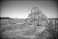
In The Fieldsby Penny LaneComment: I think this would have worked better if it had been darker, giving more contrast between the bales and the ground. |
| Photographer found comment helpful. |
| 04/26/2010 04:15:55 PM |
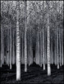
The Forest For The Treesby scarbrdComment: Very nice! I love the lines and the contrast between the lower third (ground and trunks), middle third (trunks), and upper third (trunks and leaves against sky). |
| Photographer found comment helpful. |
| 04/26/2010 04:14:07 PM |
1722by Yo_SpiffComment: I think I would have like this composition better if it had stuck closer to the rule of thirds. |
| Photographer found comment helpful. |
| 04/26/2010 04:09:29 PM |
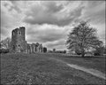
Knaresborough, UKby p2jvrComment: The business of this shot would work better if there were more contrast between the bridge and the houses. |
| Photographer found comment helpful. |
| 04/26/2010 04:02:19 PM |
|
| Photographer found comment helpful. |
| 04/26/2010 04:00:26 PM |
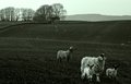
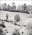
bucolicby krnodilComment: I think I can see why you choose to blow this out, but I don't think it helps the shot. |
| Photographer found comment helpful. |
| 04/26/2010 03:44:21 PM |
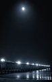
Boardwalkby Breeee123Comment: I really like this shot and I hope not too many people vote it down because of the blue tinge. ;-) However, I would have cropped out the moon, as I think it distracts from the boardwalk; my eye was bouncing up and down. |
| Photographer found comment helpful. |
Home -
Challenges -
Community -
League -
Photos -
Cameras -
Lenses -
Learn -
Prints! -
Help -
Terms of Use -
Privacy -
Top ^
DPChallenge, and website content and design, Copyright © 2001-2024 Challenging Technologies, LLC.
All digital photo copyrights belong to the photographers and may not be used without permission.
Current Server Time: 05/19/2024 07:41:51 AM EDT.