| Image |
Comment |
| 12/29/2003 06:15:26 AM |
|
 Photographer found comment helpful. Photographer found comment helpful. |
| 12/29/2003 06:14:43 AM |
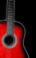
Enrich your life with music...by WILDBLUEComment: The manipulation here borders on too much. Especially the white glow around the quitar. It's almost too simple. You definitely need the text in this image. |
| Photographer found comment helpful. |
| 12/29/2003 06:13:40 AM |
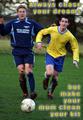
Always chase your dreamsby PaulMdxComment: This would certainly be great for a sports motivational poster. Great action shot. Love how messy they are. I am not too too keen on the yeallow text with blue border. It loooks like a poster that a college student would hang in their dorm :-)) |
| Photographer found comment helpful. |
| 12/29/2003 06:11:55 AM |
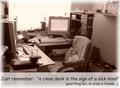
good exusesby MadMordegonComment: Oh, ooo, I am in trouble. My desk is pretty clean. I must be a raving lunatic... :-))
Love the sepia tone of this image. I think it simplifies it, otherwise this would look snapshottish. But it is good shot for the point you are trying to make. I also like the way you white out bottom portions of the image to make room for the text. Well done. |
| Photographer found comment helpful. |
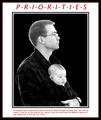
| 12/29/2003 06:10:02 AM |
Prioritiesby Spanish_GreaseComment: The message of this poster is really beautiful. But here are my suggestions: when you edit background out of an image, make sure you adjust the remaining portions to the new background. The head of the man needs a contrast adjustment to make it appear more natural. Also the baby (IMO the main subject of this shot) should be more in focus. I understand you tried hard to make it appear as a pro poster, but IMO too many borders are simply too many - simplify. |
| Photographer found comment helpful. |
| 12/29/2003 06:06:14 AM |
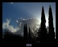
Stand Tallby GeneralEComment: Great concept and idea. Like the silver lining of the cloud and the sillueted tress. The text could have been stronger and more space around it. |
| Photographer found comment helpful. |
| 12/29/2003 06:03:37 AM |
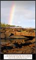
OPPORTUNITYby RiderGalComment: Cute rainbow shot. It's a bit out of focus in the front portion of the perspective, but the back is nice. The text should have been reversed white on black, instead of using block of space over your black mat. The font is also bit fancy. |
| Photographer found comment helpful. |
| 12/29/2003 05:56:30 AM |
|
| Photographer found comment helpful. |
| 12/29/2003 05:55:19 AM |
|
| Photographer found comment helpful. |
| 12/29/2003 05:54:58 AM |
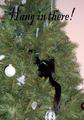
Hang in Thereby jpb323redComment: This is so funny. Poor kitten, must be prickly. You've probably used flash, and due to that lost some detail in the lighter areas of the image (mainly the decorations). The text in black is ok, but the type face itself is a bit wild and could be better on the bottom of the image. |
| Photographer found comment helpful. |
Home -
Challenges -
Community -
League -
Photos -
Cameras -
Lenses -
Learn -
Help -
Terms of Use -
Privacy -
Top ^
DPChallenge, and website content and design, Copyright © 2001-2025 Challenging Technologies, LLC.
All digital photo copyrights belong to the photographers and may not be used without permission.
Current Server Time: 04/23/2025 06:44:53 AM EDT.