| Image |
Comment |
| 12/29/2003 03:39:36 AM |
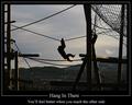
Hang In Thereby browntComment: Nice framing. The colours and tones are on the darker side, but I guess this was too far for a flash to be of any use. The aerial perspective is nice. |
 Photographer found comment helpful. Photographer found comment helpful. |
| 12/29/2003 03:38:17 AM |
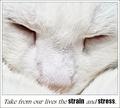
Take from our lives the strain and stressby pcodyComment: Such a sweet photo. Love the detail of the fur. Great that it is kind of white all over as it really portrays the peacefulness. I am not too keen on the font you used, but over all it is ok. The outer border could have been dropped for simplicity. Well done. |
| Photographer found comment helpful. |
| 12/29/2003 03:36:40 AM |
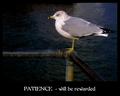
Patienceby pitsamanComment: Photo is superb. Colours look very natural. But the font is kind of wild and unseen in pro posters. But if that's your style, then go for it. Well done photo. |
| Photographer found comment helpful. |
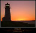
| 12/29/2003 03:33:19 AM |
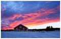
Beauty Seen is Never Lostby indigo997Comment: Beautiful sunset/sunrise colours. The lighter part of the image is a bit overexposed, but the rest of the image is good. I would have loved to see the text below the image as a poster, but no marks taken for that. Still one of my picks. |
| Photographer found comment helpful. |
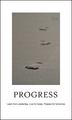
| 12/29/2003 03:31:31 AM |
Progressby ronnersComment: Very classy. Simple, yet powerful. Interesting DOF. Love the text (the font). Well done. |
| Photographer found comment helpful. |
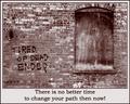
| 12/29/2003 03:30:46 AM |
Tired of Dead Ends?by TooCoolComment: Beautiful photograph, but the fonts is kind of distorted and fuzzy. Also you could have given the text more space around it to separate the image from the text. Posters usually don't have borders on the edges. The middle border would have been enough. But the photo itself is great! |
| Photographer found comment helpful. |
| 12/29/2003 03:28:51 AM |
Imaginationby magnetic9999Comment: I really like the way I am drawn to the face and the eye. Great contrast of the red hair and the grey coat. Photo is very well done, the text could have been a tiny bit smaller and along the bottom. On the top as it is, it throws the image a bit out of kilt. Otherwise well done. |
| Photographer found comment helpful. |
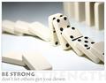
| 12/29/2003 03:26:37 AM |
Be Strongby KonadorComment: Great concept, well designed. Like the ghosted word under the grey text. Image is dead on. Lovely DOF and composition in the photo. Simple and clean. Love it. |
| Photographer found comment helpful. |
| 12/29/2003 03:25:46 AM |
|
| Photographer found comment helpful. |
| 12/29/2003 03:24:17 AM |
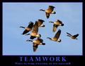
Teamworkby dan_pendletonComment: Love this poster. Simple, but clean and beautiful. Gees are truly smart birds. We should learn from them about teamwork. Great clarity and sharpness. Like the blue text, but the purple border should have been similar shade of blue (it's kind of out of place). Otherwise very well done. |
| Photographer found comment helpful. |
Home -
Challenges -
Community -
League -
Photos -
Cameras -
Lenses -
Learn -
Help -
Terms of Use -
Privacy -
Top ^
DPChallenge, and website content and design, Copyright © 2001-2025 Challenging Technologies, LLC.
All digital photo copyrights belong to the photographers and may not be used without permission.
Current Server Time: 04/22/2025 11:09:54 PM EDT.