| Image |
Comment |
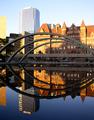
| 10/10/2003 05:09:27 AM |
afternoon reflections by tp-fcpComment: Beatiful composition and colour. Too bad the arches are chopped off at the ends. The sky is bit overexposed, but the image holds well. One of my favs. |
 Photographer found comment helpful. Photographer found comment helpful. |
| 10/10/2003 05:08:20 AM |
|
| Photographer found comment helpful. |
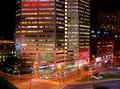
| 10/10/2003 05:07:28 AM |
The colors of the nightby AmielComment: The colours are really great, the composition is so so. This would have been probably better in vertical format. Also the left bottom corner distracts a bit. Overall nice image. |
| Photographer found comment helpful. |
| 10/10/2003 04:48:11 AM |
Urban Landscapeby Dim7Comment: Either inclussion of more sky or exclussion of it would have helped this interesting photo. Love the colours, but the image needs a contrast adjustment. |
| Photographer found comment helpful. |
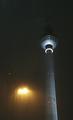
| 10/10/2003 04:47:21 AM |
tower in the rainby stephanComment: Great rain capture. Lovely composition and ontrast. I hope you don't get voted down because it is not as sharp as it would be without the rain. But the rain makes this image. Be careful about the lens glare. |
| Photographer found comment helpful. |
| 10/10/2003 04:47:03 AM |
A Farmer's New Cash Cropby mcraelComment: Very artistic shot. Like the lamp posts in the background that balance the image off. You could fix the contrast a little bit - it's kind of monotone, so maybe b&w would work well the emphasize the structure of the image instead of the greyish colour. |
| Photographer found comment helpful. |
| 10/10/2003 04:36:38 AM |
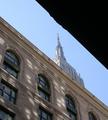
ESB-A different point of view.by catpixelComment: Looks alsmot abstract - which is good. The upper right corner is a bit too dark - which overpowers the rest of the image. The shadows on the lower building are great. |
| Photographer found comment helpful. |
| 10/10/2003 04:34:16 AM |
High Riseby ScantyNebulaComment: This would have been better in vertical format to emphasize the highrise building. This way it diminishes the power of it. Succesful sepia tone you have here. |
| Photographer found comment helpful. |
| 10/10/2003 04:29:17 AM |
duotone townby rhipsterComment: Don't like the duotone colour. It would probably have looked better in warmer yellowish duotone, since it's sunny bright day. Even triotone with this colour and yellow oposite. Other than that - nice perspective and sharpness. |
| Photographer found comment helpful. |
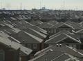
| 10/10/2003 04:22:38 AM |
Desirable Residenceby agwrightComment: Interestingly enough, there is another image just like yours in this challenge. Yours is more of a closeup of this complex. I think you should have make the street even more off centre here - or centre it properly. This way is a bit off kilt. Did you use tripod? It's a bit fuzzy. |
| Photographer found comment helpful. |
Home -
Challenges -
Community -
League -
Photos -
Cameras -
Lenses -
Learn -
Help -
Terms of Use -
Privacy -
Top ^
DPChallenge, and website content and design, Copyright © 2001-2025 Challenging Technologies, LLC.
All digital photo copyrights belong to the photographers and may not be used without permission.
Current Server Time: 04/21/2025 06:29:03 AM EDT.