| Image |
Comment |
| 11/13/2005 07:17:19 AM |
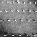
Restby tjmuellerComment: The idea is good, but I don't think this is the best perspective for it, I miss the way that leads to the end. I would take a low angle and swallow DOF, highlighting one of the graves well. Maybe the further one, not the closer one, this way DOF would surely highlight to the end, the far side of the photo, which stops my eyes. Just an idea. |
 Photographer found comment helpful. Photographer found comment helpful. |
| 11/13/2005 07:15:27 AM |
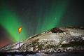
Nowhere to go but upby LalliSigComment: Amazing colours! I don't like the road sign anyway, maybe because of the yellows. Maybe a no-drive-in sign or end-of-the-street table would fit better. Alltogether, the light of nature is simply stunning. |
| Photographer found comment helpful. |
| 11/13/2005 07:13:35 AM |
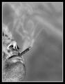
Slow, but certain dead endby samanwarComment: Great composition and B&W. PhotoShop effect is though, too much much for me. For my taste, cleaner smoke and not that oversharpened face would do better. Maybe a darker background would highligt the smoke better. |
| Photographer found comment helpful. |
| 11/13/2005 07:11:22 AM |
Used and Deniedby viljoendaleComment: Once I had a similar idea about visas for On the edge challenge. It did not finish well, but I hope yours does better. I like the DENIED text on the shot. The background is wild, I would use somewhat more official colour and a tighter crop (no matter if edges and parts get outside the photo) and a lower angle to make the shot more interesting and gove a perspective. |
| Photographer found comment helpful. |
| 11/13/2005 07:08:07 AM |
End of the Road in Oz by scalvertComment: Humorous capture, very well presented. I love the idea, which is surely creative for this challenge and the colours as well. As I am a summer phanatic, autumn also means me the end of the best days of a year.
Good luck! |
| Photographer found comment helpful. |
| 02/02/2005 02:19:17 AM |
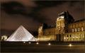
Le Louvre by GabrielComment: I knew you win! :) Congrats on a very well deserved ribbon, great job, way to go! |
| Photographer found comment helpful. |
| 01/30/2005 12:09:37 PM |
|
| Photographer found comment helpful. |
| 01/30/2005 12:01:05 PM |
Chip&Coinby zarniwoopComment: Nice ida and composition. :-) I feel though WB problems here, too much reds and yellows. I would have used a dark background to highlight the light tones of the coins and the credit card. |
| Photographer found comment helpful. |
| 01/30/2005 11:52:16 AM |
Just Three In A Rowby KaralewComment: Amazing colours! Composition and lighting is spot on, too! :-) I wish there was a bit more space on the bottom, but still one of my favourites in this challenge. :-) |
| Photographer found comment helpful. |
| 01/30/2005 11:51:05 AM |
Glassesby KiwiChrisComment: Simple but clear tones, shapes and composition. I especially like the lighting here. One of my favourites in this race, good luck!! :-) |
| Photographer found comment helpful. |
Home -
Challenges -
Community -
League -
Photos -
Cameras -
Lenses -
Learn -
Help -
Terms of Use -
Privacy -
Top ^
DPChallenge, and website content and design, Copyright © 2001-2025 Challenging Technologies, LLC.
All digital photo copyrights belong to the photographers and may not be used without permission.
Current Server Time: 04/21/2025 10:37:15 PM EDT.