| Image |
Comment |
| 09/02/2011 09:32:38 AM |
The Artisan by gyabanComment: The amount of time this must have taken entitles you to a Ribbon automically! Haha
It is superb out the box thinking and I hope you do well. |
 Photographer found comment helpful. Photographer found comment helpful. |
| 08/31/2011 08:31:13 AM |
Just Look Upby jimnessComment: A reminder just how small and inconsequential we are in the greater scheme of things... oh and a lovely photo too!
Its a wonderful documentary type of photo. I wish it had a bit of something here on earth too in the shot to show the scale etc... kind of like the other shot in this challenge. |
| Photographer found comment helpful. |
| 08/31/2011 08:15:15 AM |
|
| Photographer found comment helpful. |
| 08/31/2011 05:42:32 AM |
Tongue of the Dragon - 3"2by crowisComment: Lovely shot but would have looked 1,000,000,000 times better if it was not so blury. Either your focus was off or your image stabiliser was still on when the camera was on the tripod or the tripod was not very steady (wind perhaps?)... |
| Photographer found comment helpful. |
| 08/31/2011 05:29:25 AM |
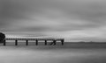
Tranquility in Contrastby DakotaFontaineComment: I'm in two minds about that rock / tree on the far left... Yes it gives the jetty some grounding but it also keeps pulling my eye away from the rest of the image. Would have like the jetty a bit sharper as well. I like the minimalism about it and overall I say nice shot! |
| Photographer found comment helpful. |
| 08/31/2011 05:24:12 AM |
Dizzyby Samantha_TComment: Wonderfully artistic shot. Pity her right arm (our left) is also moving a bit - but I hope this does well. I'm sure it wasnt easy to keep everything but the head still. |
| Photographer found comment helpful. |
| 08/31/2011 05:22:49 AM |
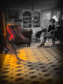
Visitingsby jjbeguinComment: Creepy! Intersting choice to make the "visitor" in color and the "normal person" in B&W. I probably would have done it the other way around.
If the "normal life" was more in focus / sharper / without that little bit of blur then it would have done much better. |
| Photographer found comment helpful. |
| 08/31/2011 03:52:28 AM |
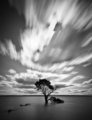
Calm the Sea, Move the Cloudsby MargaretNetComment: Haven't seen all the shots yet but this is my pic for the front page so far. Composition is more in quarters than thirds (on the vertical) and the tree is a little central. Not sure what other composition options you had though...
Lovely shot and great work both in technique and PP |
| Photographer found comment helpful. |
| 08/31/2011 03:45:43 AM |
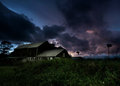
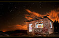
Lights Are On But Nobody's Homeby rubentinajero7Comment: Clearly two of you went shooting together - which is perfectly fine. I do however prefer the other shot. Something in your technique has let you down and the result is a very noisy image - probably not to most people's liking but perhaps you wanted it to look that way?? Either this was shot with an ISO set way to high or you brightened it a lot in PP.
The light inside the house / windows is a bit bright and overpowers the shot a bit. The sky is very noisy and doesn�t seem to be focused very well.
A great concept but lacking a little in execution. |
| Photographer found comment helpful. |
| 08/31/2011 03:40:02 AM |
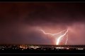
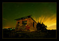
Life Is But A Dreamby JessicaVComment: Clearly two of you went shooting together - which is perfectly fine. I prefer this one even though your building looks a bit wonky. Your technique is good and has resulted in a pretty noise free shot. I also love the way the clouds movement is perendicular to the movement of the stars. Woul dhave been nice to see perhaps just a bit more light inside the house / windows though. Overall good job! |
| Photographer found comment helpful. |
Home -
Challenges -
Community -
League -
Photos -
Cameras -
Lenses -
Learn -
Help -
Terms of Use -
Privacy -
Top ^
DPChallenge, and website content and design, Copyright © 2001-2025 Challenging Technologies, LLC.
All digital photo copyrights belong to the photographers and may not be used without permission.
Current Server Time: 04/12/2025 06:18:44 AM EDT.